SANGWICH CLUB
east bureau
ARCHITECTS
east bureau
LEAD ARCHITECTS
Adilbek Zhiyembayev
LEAD TEAM
Adilbek Zhiyembayev
PHOTOGRAPHS
Damir Otegen
AREA
110 m²
YEAR
2026
LOCATION
Almaty, Kazakhstan
CATEGORY
Coffee Shop Interiors
English description provided by the architects.
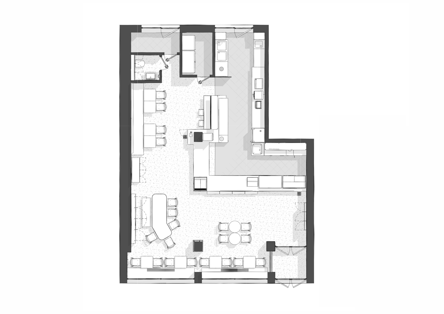
Sangwich Club is a 109.3-square-meter sandwich bar in central Almaty, designed by east bureau as a place that reveals itself gradually.
Rather than building the interior around a single visual gesture, the project brings together the existing character of the space, the brand's visual language, and a series of custom-designed elements that echo one another throughout the interior.
The project began with a former bank space that had been largely unused for several years. During demolition, suspended ceilings and partitions revealed a higher volume, along with columns, beams, cracks, and layers of old plaster.
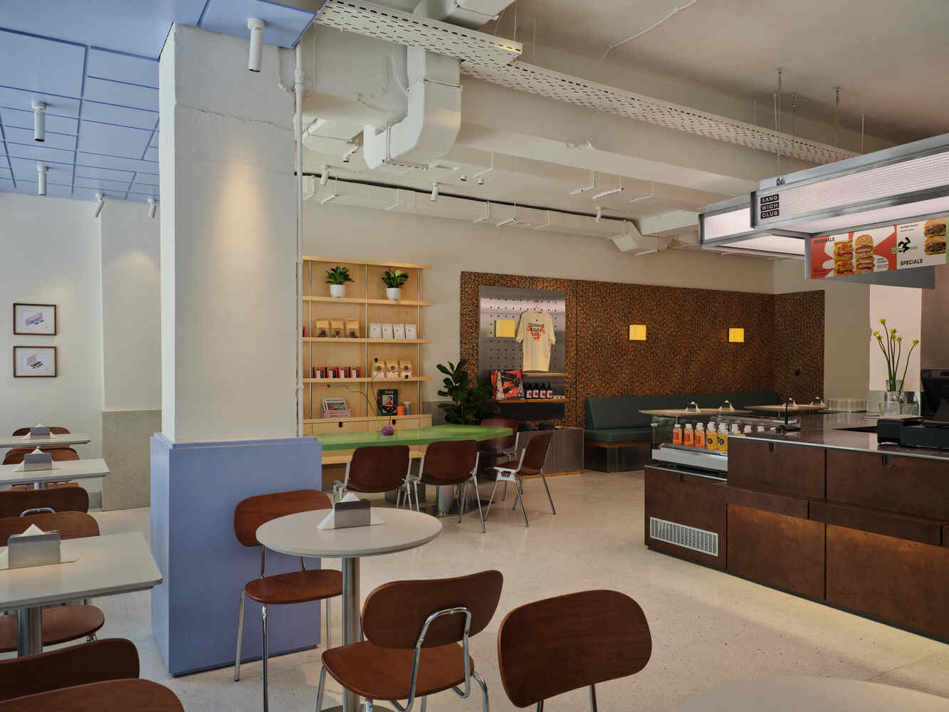
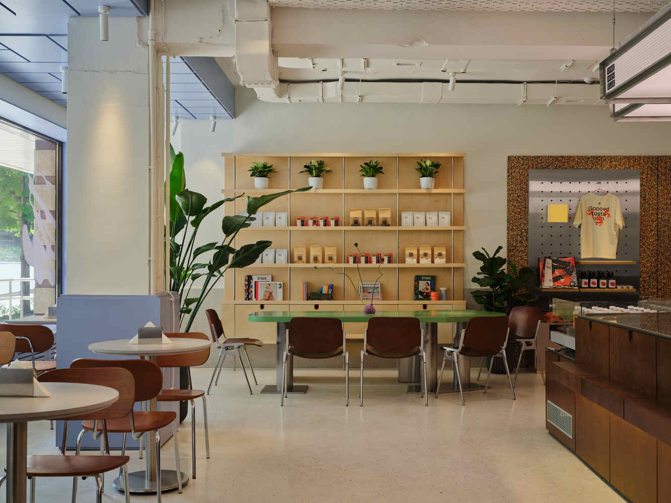
Instead of concealing these traces behind new finishes, east bureau chose to keep them visible and use the existing shell as a quiet background for the new intervention.
The client wanted Sangwich Club to feel considered rather than inexpensive while remaining recognizable as part of an established brand.
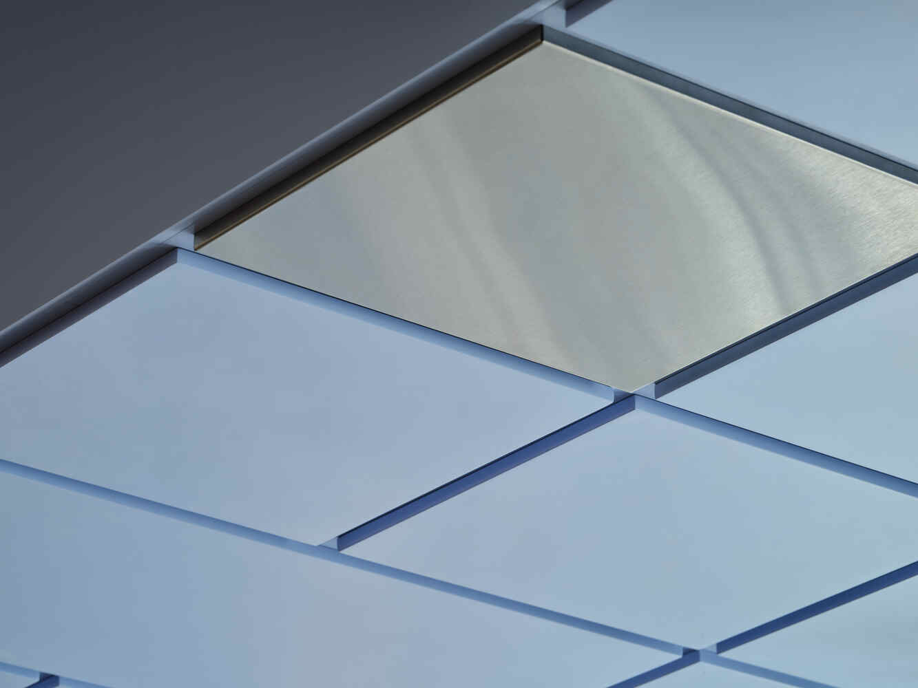
The studio therefore translated selected elements of the existing visual identity into spatial details instead of reproducing the brand book literally.
At the same time, the design developed another recurring idea from the product itself.
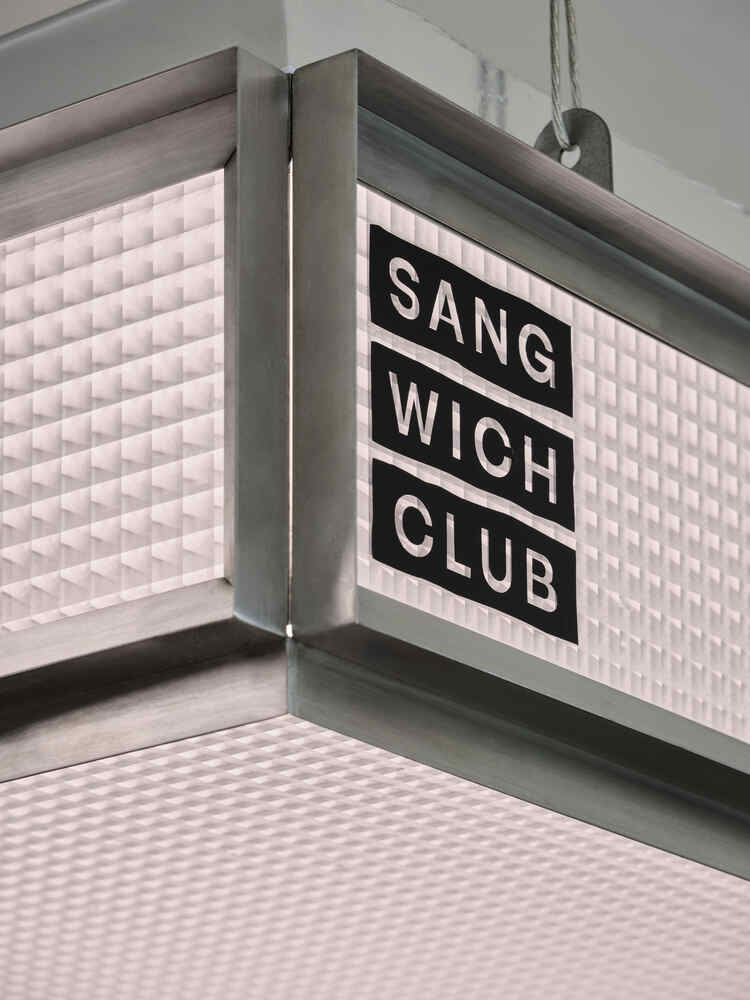
One motif is the square, derived from the logo. It appears at different scales in lighting, ceiling panels, furniture, and smaller details.
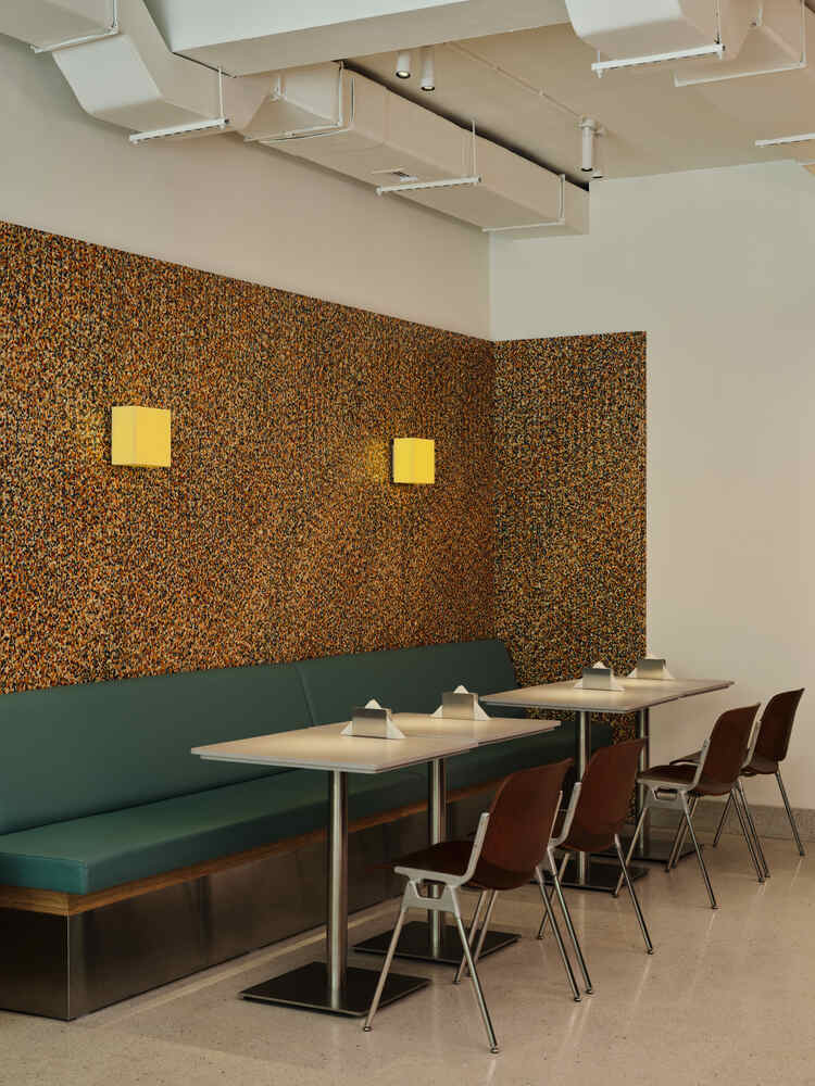
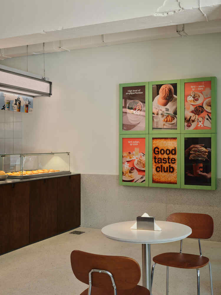
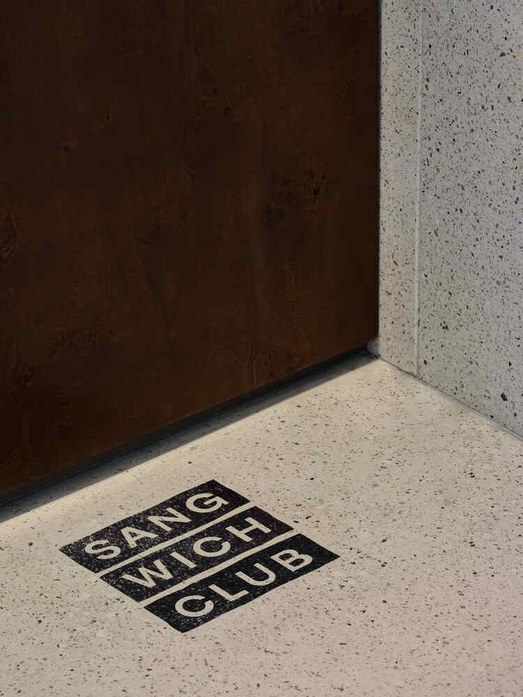
Black marble versions of the logo are also inlaid directly into the terrazzo floor, appearing unexpectedly in front of the counter and the water station.
The second motif is layering, taken from the sandwich itself. Stepped profiles and cut-outs recur in handles, panels, and countertops.
The square and the layer operate as two parallel ideas throughout the interior — one originating from the visual identity and the other from the product.
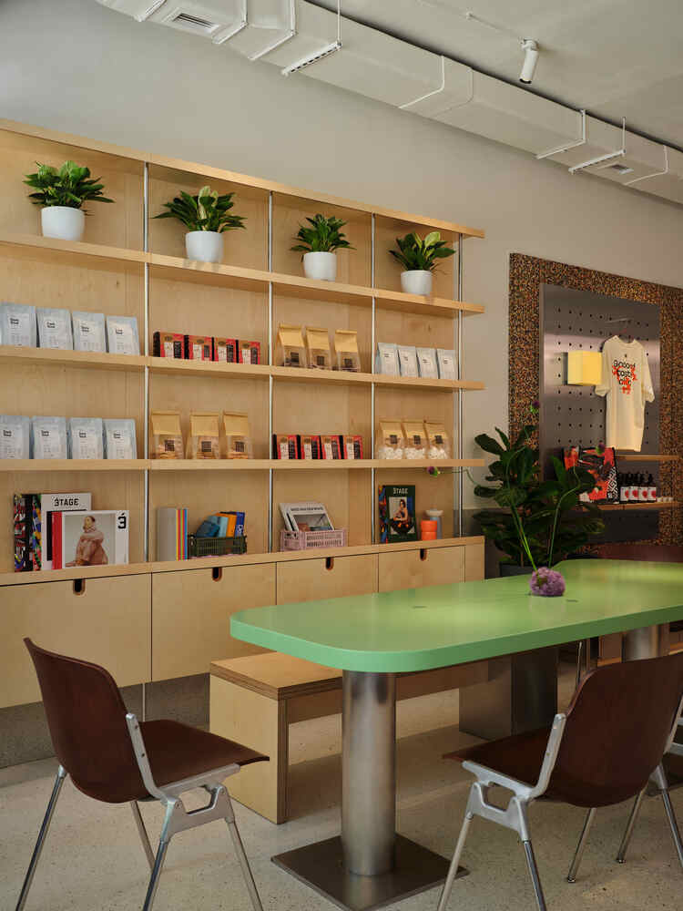
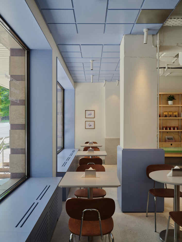
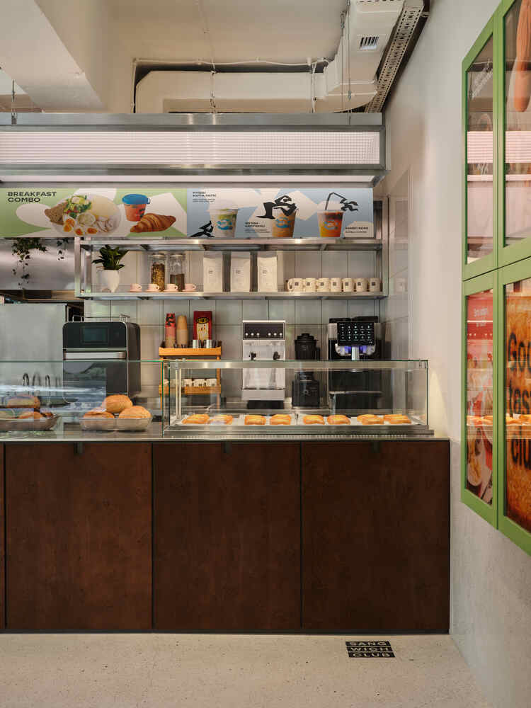
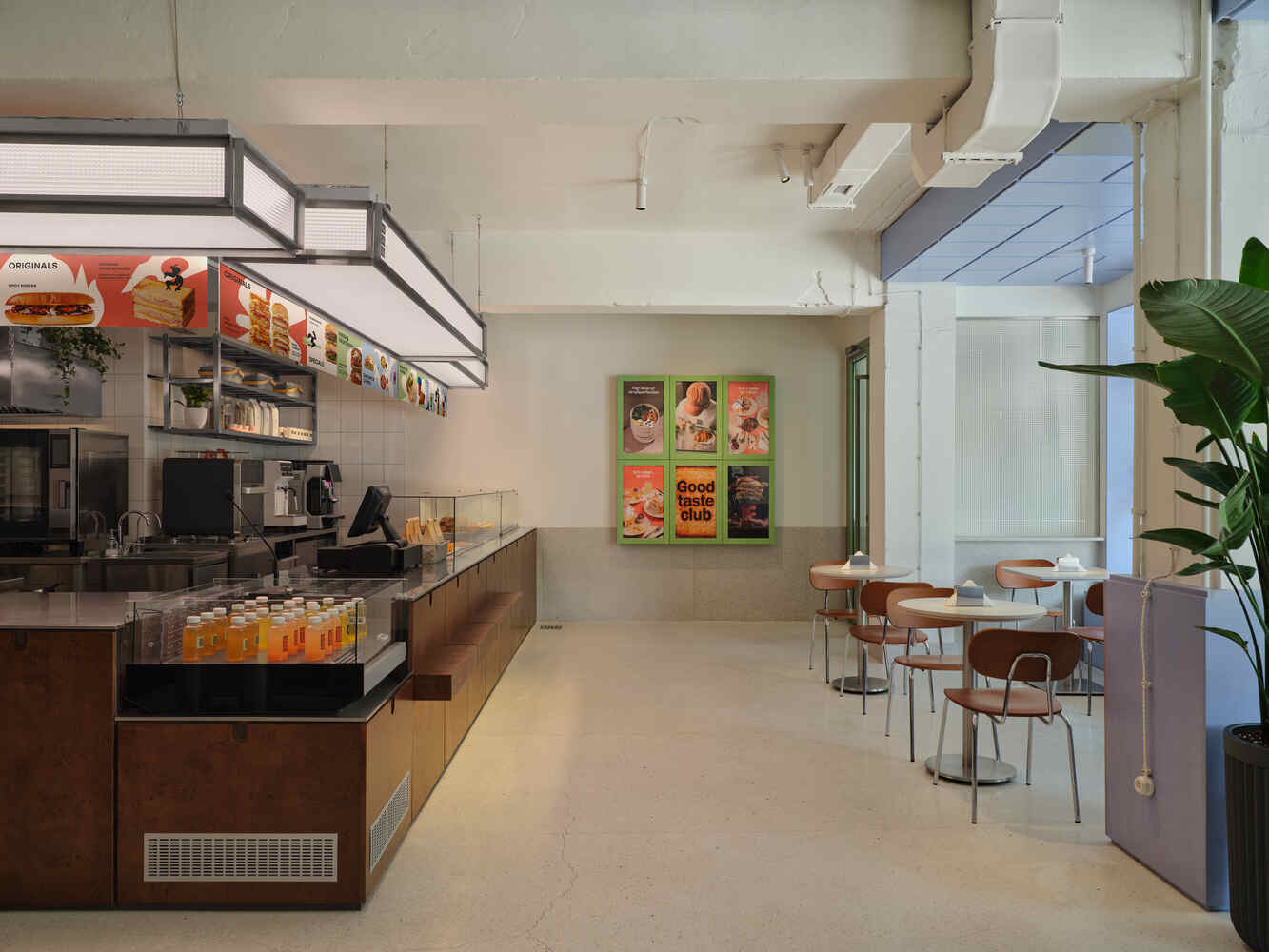
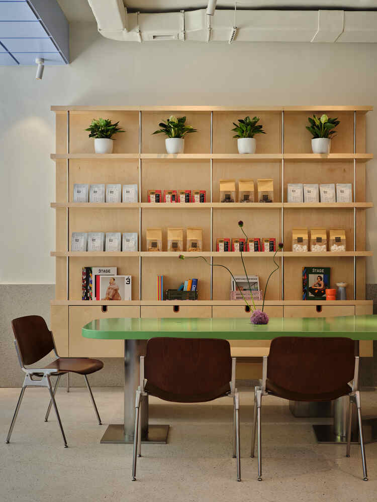
Color is concentrated in particular zones rather than spread evenly through the room.
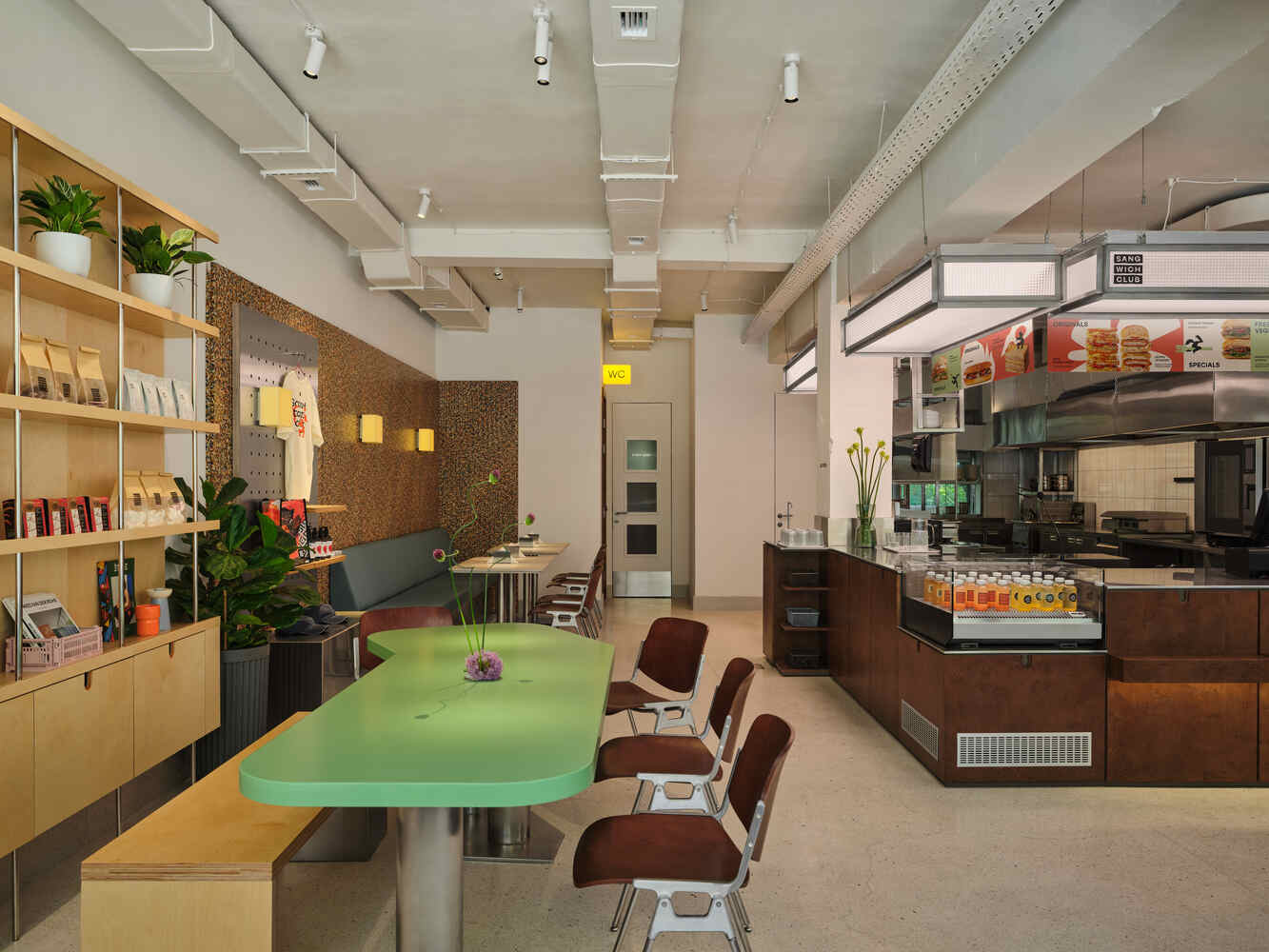
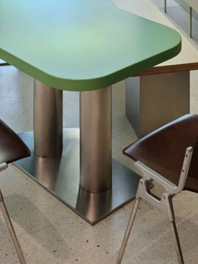
Blue defines the seating along the existing windows, green appears in the central table and furniture, while a more saturated combination marks the banquette and merchandise area.
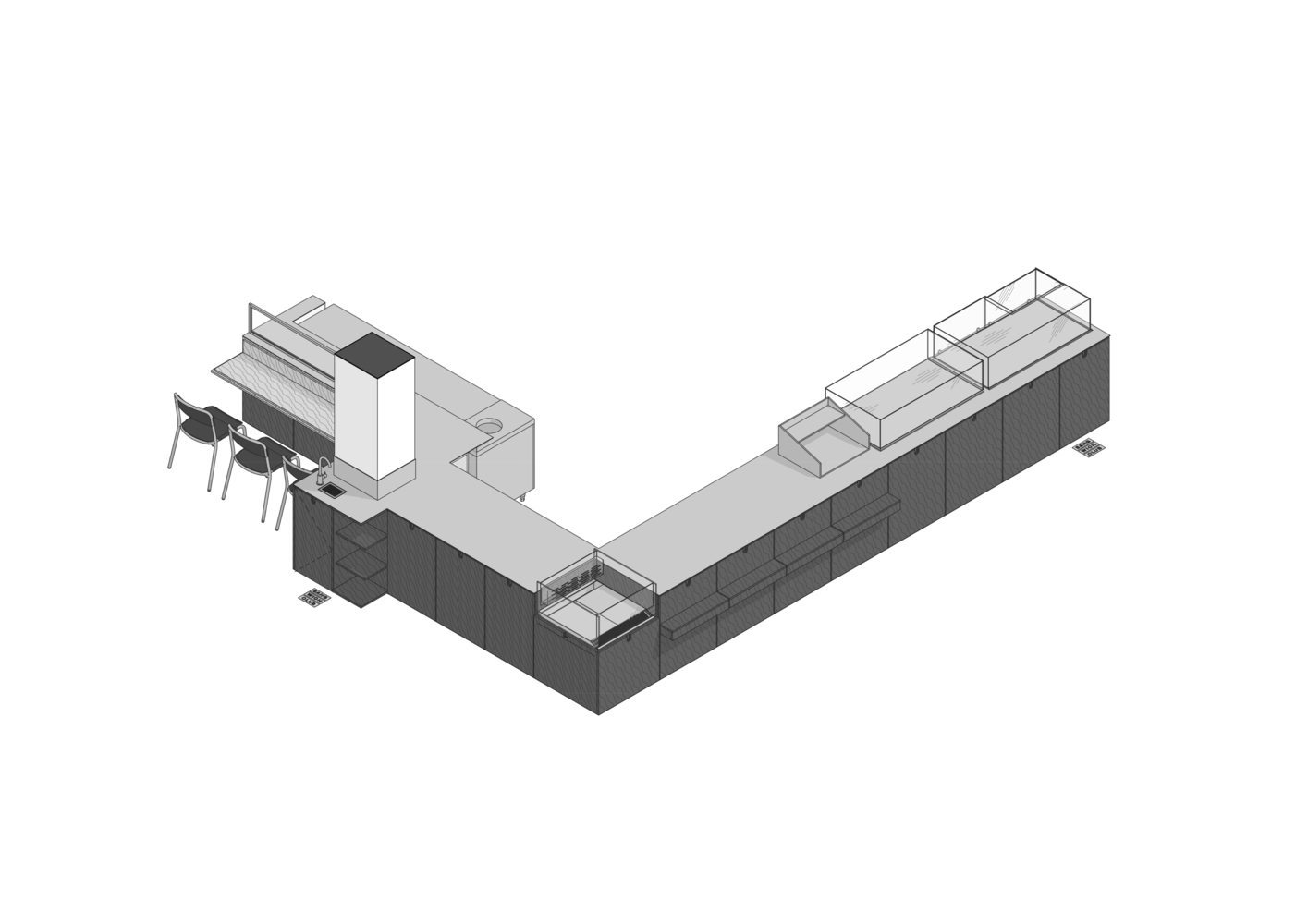
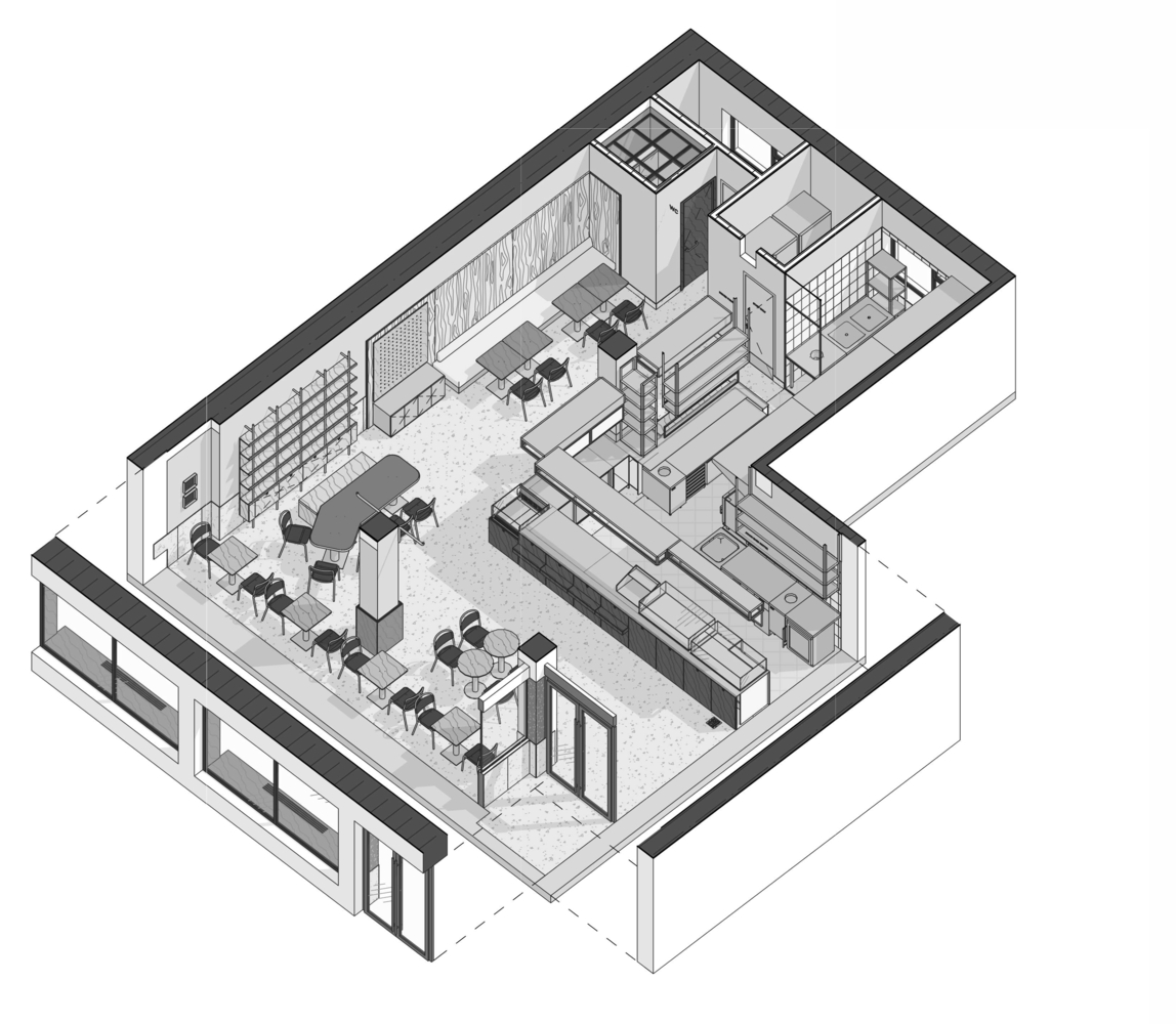
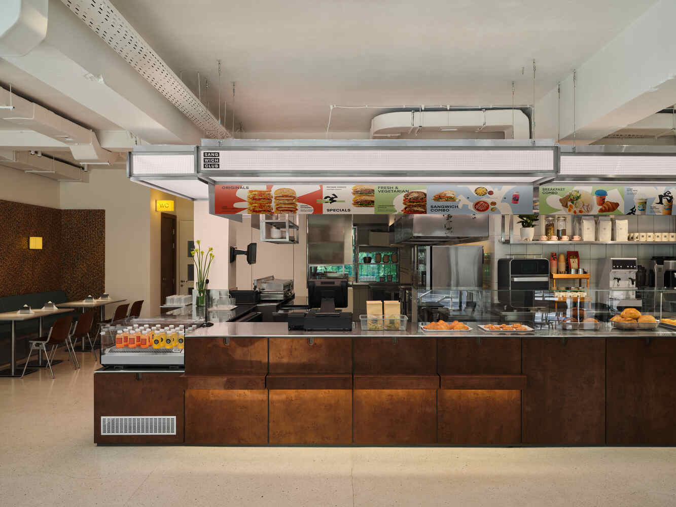
The spatial organization begins with the product. An L-shaped display counter starts close to the entrance and continues alongside the open kitchen, keeping the food and part of its preparation visible.
The counter is clad in ash burl veneer sourced through workshops in Almaty.
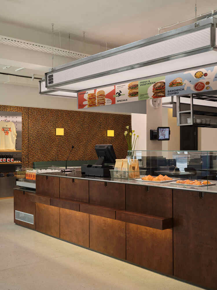
Its expressive grain loosely recalls veneers found on older Soviet-era furniture familiar from local interiors, without becoming a literal historical reference.
Above the counter hangs the project's largest custom light element, following the geometry below.
The initial design proposed fluted glass with a square texture, another subtle reference to the logo. Because of its weight, the glass was replaced with acrylic.
Fluted film was applied vertically to one side and horizontally to the other, creating the intended square texture where the two layers overlap. A concealed light source produces a soft, diffused glow.
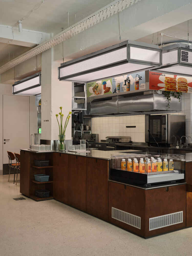
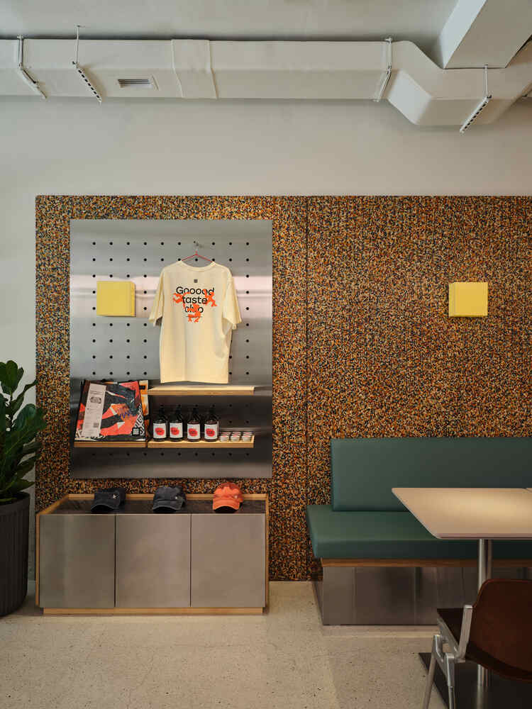
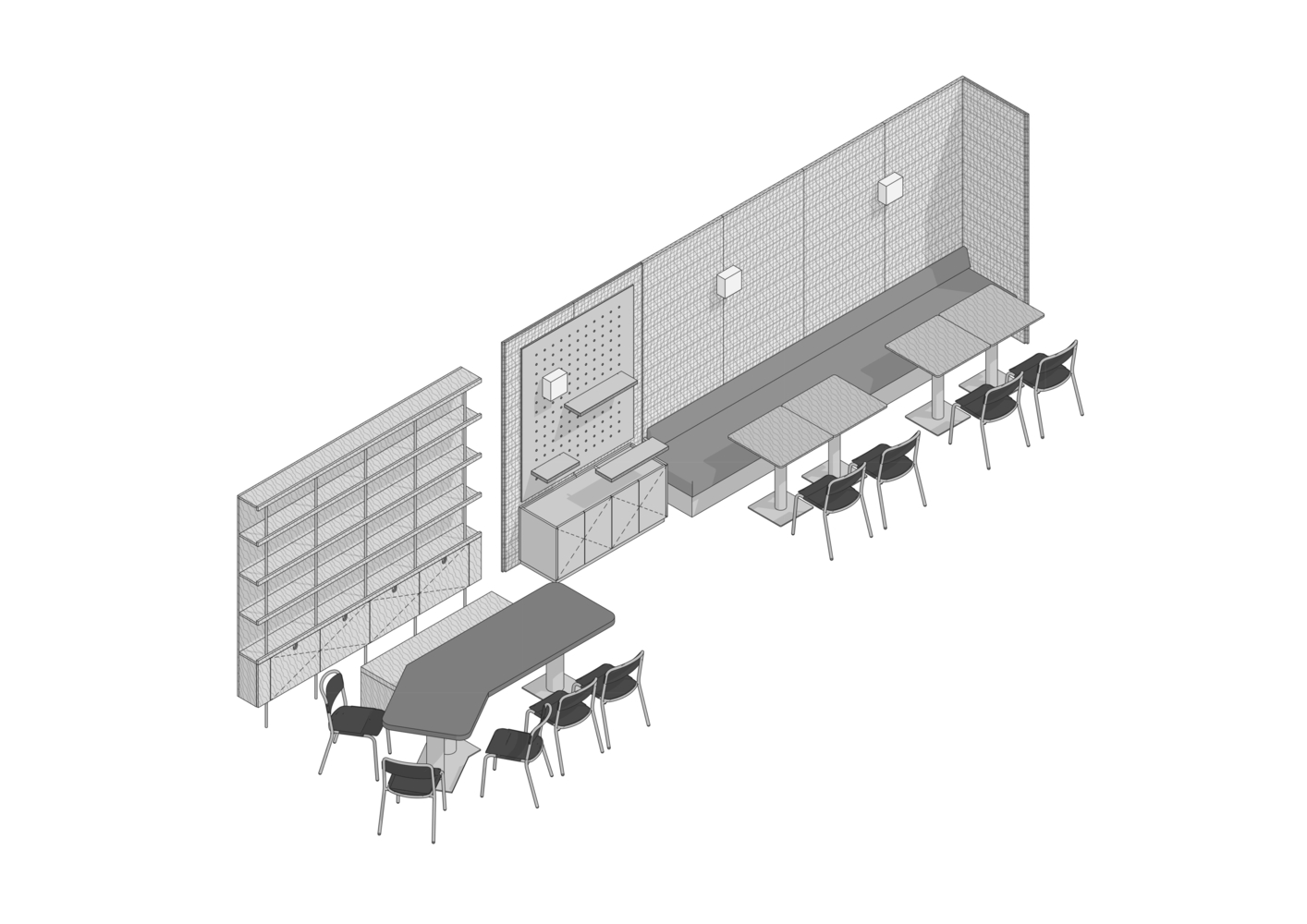
The room is not organized around a single focal point. A gently curved communal table occupies the center, while seating continues along the existing windows, whose low sills are incorporated as additional places to sit.
Further inside, a multicolored veneered wall forms the backdrop to a banquette and merchandise area. Together, these elements create several distinct places within one open room.
The material palette is straightforward: natural veneer, plywood, painted surfaces, terrazzo, and stainless steel. Most built-in furniture and larger objects were designed specifically for the project.
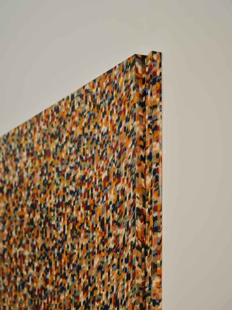
Some decisions developed during construction, including the multicolored veneered wall, whose final material was discovered while visiting veneer workshops in Almaty after the originally specified finish proved too expensive.
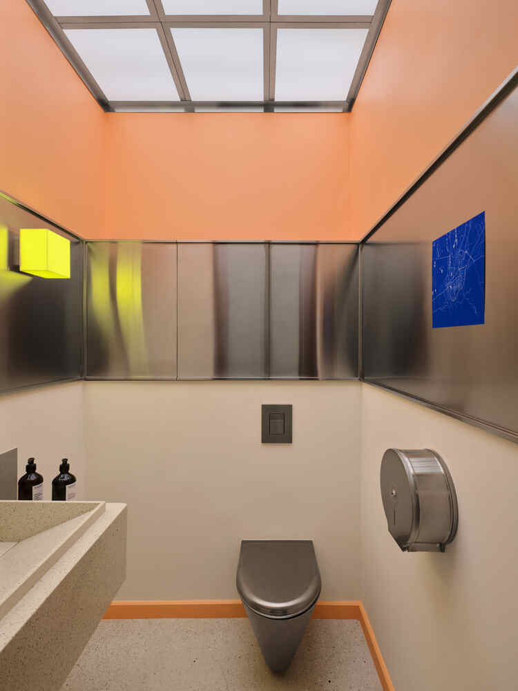
The restroom is treated almost as a separate room. Its walls are clad in stainless-steel panels, while the mirror and lighting continue the square geometry found throughout the main space.
Opposite the mirror, an image of Almaty in intense blue introduces a direct reference to the city.
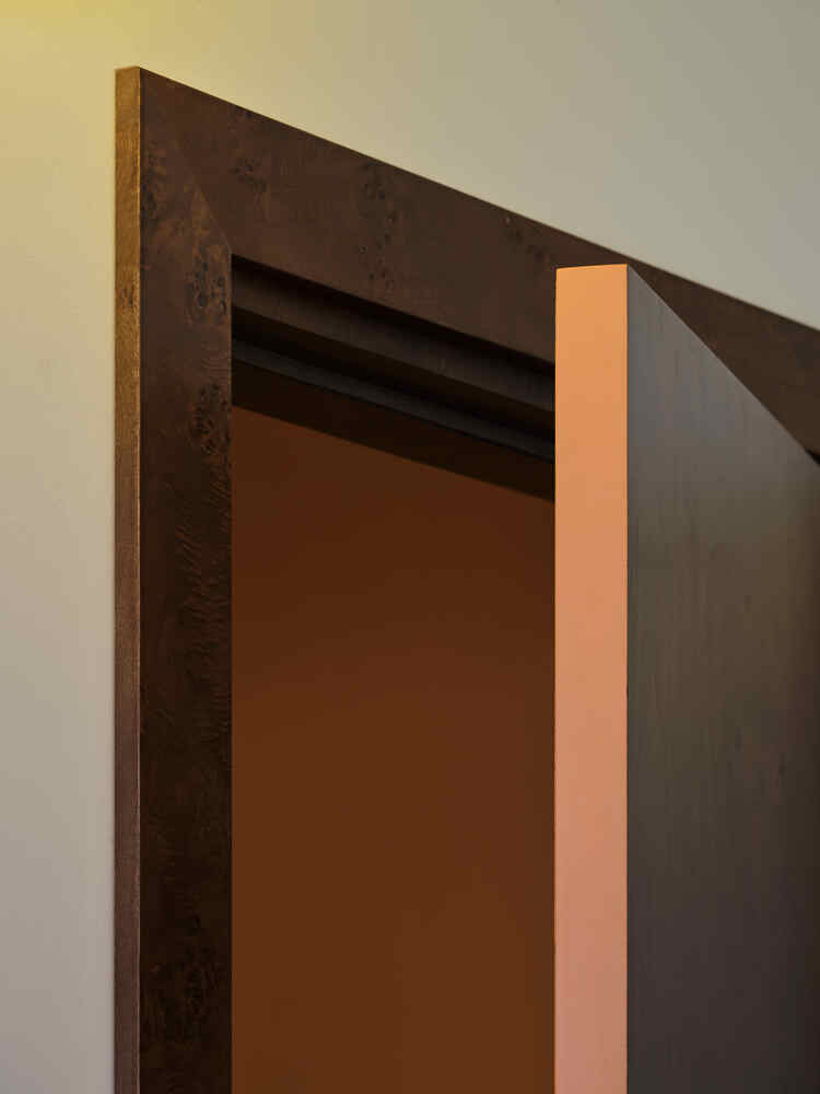
The custom washbasin, stainless-steel fixtures, and a terracotta-painted door edge extend the project's material and color language into smaller details.
Outside, the intervention to the shared facade was kept minimal.
Two square lightboxes provide the main signage, while the existing windows remain visually open, allowing light, people, and activity inside to become part of Sangwich Club's presence on the street.
The finished interior is intended to create curiosity on a first visit and familiarity over time.
East bureau describes it through the analogy of a well-dressed person: the overall impression comes first, while the material, cut, and smaller details reveal themselves gradually.
Not everything is meant to be discovered immediately – some details appear only with time, giving visitors another reason to look closer, stay, and return.