Suupaa Restaurant And Convenience Store
SUUPAA RESTAURANT AND CONVENIENCE STORE
If Architecture
ARCHITECTS
If Architecture
CONTRACTOR
Canopy
CLIENT
Suupaa
PHOTOGRAPHS
Sharyn Cairns
AREA
176 m²
YEAR
2025
LOCATION
Melbourne, Australia
CATEGORY
Restaurant, Grocery Store
English description provided by the architects.
Enigmatic and eclectic, Suupaa is a first-of-its-kind, hospitality concept for a hybrid fast-casual Japanese restaurant and konbini convenience store.
Acknowledging the cultural significance of 'konbinis' in Japan, the design for the venue extrapolates key aspects of the familiar typology into the modern fit-out, bringing forward ideas of utilitarian materials, fastidious organisation, efficiency, and innovation.
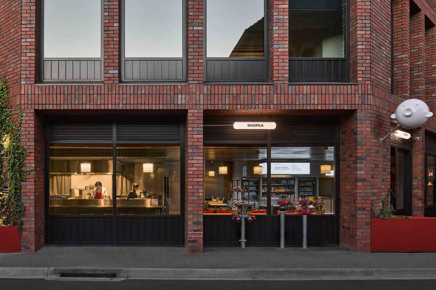
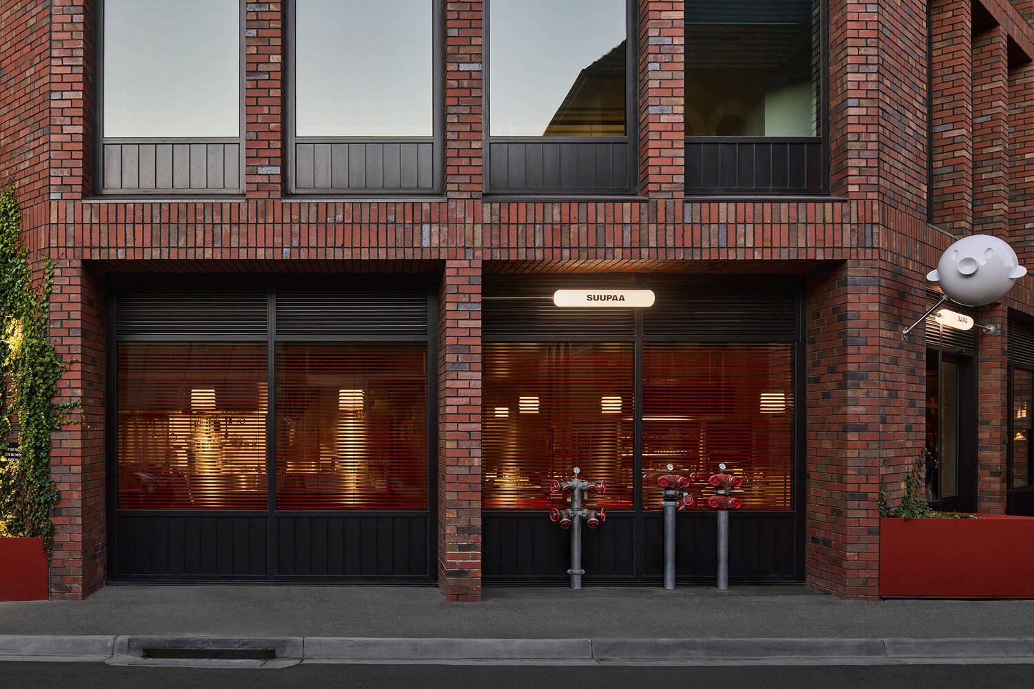
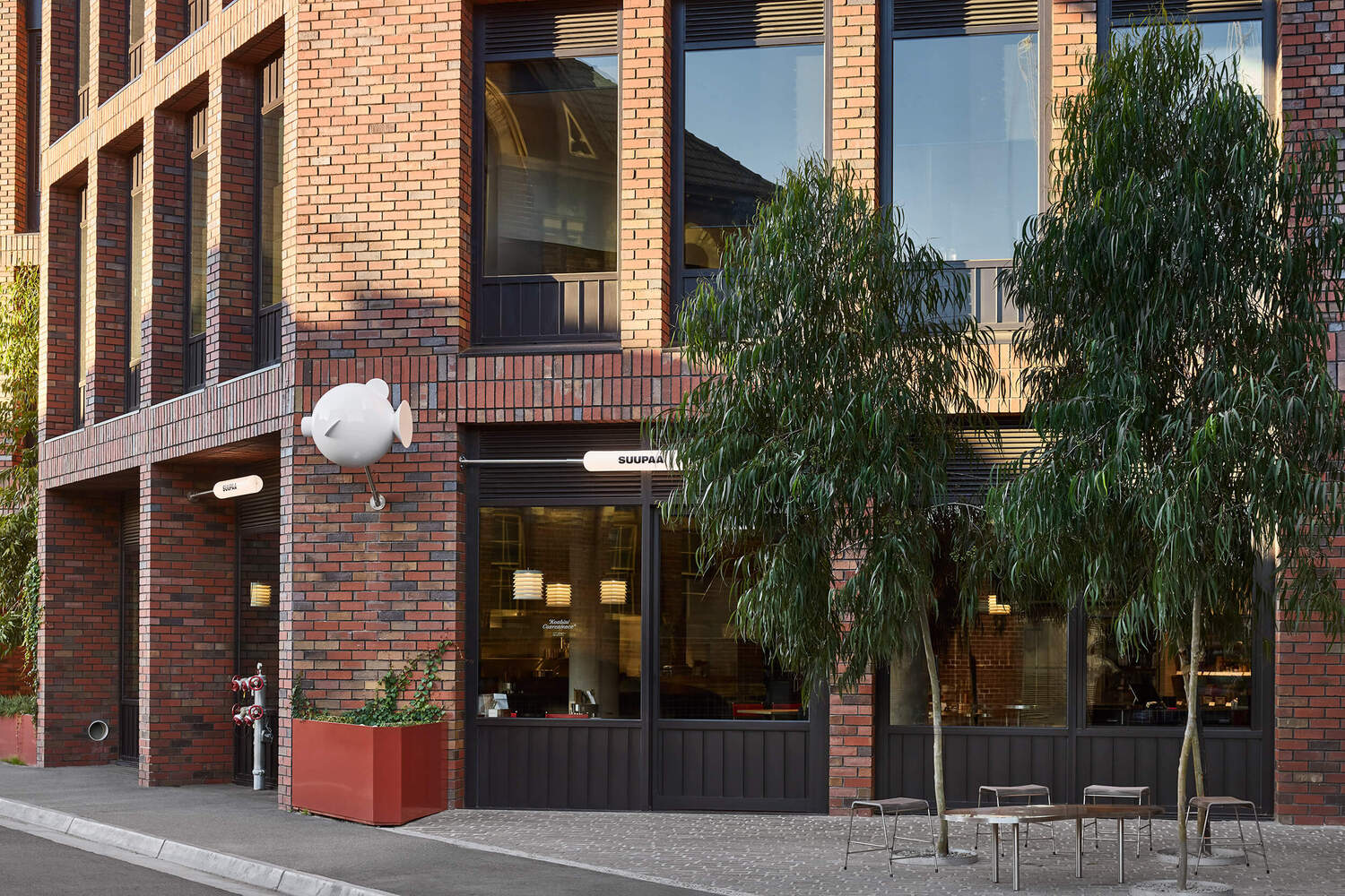
Positioned within a new existing red-brick building along a narrow street in the stylish tech hub of Cremorne, the bold fit-out and angled signage extend out from the glazed frontage to capture the attention of locals passing by.
Planters and hospitality spaces appear to spill out from the interior onto the footpath. The bold hues and rhythm of the brickwork seamlessly integrate with the conceptual framework of the interior spaces.
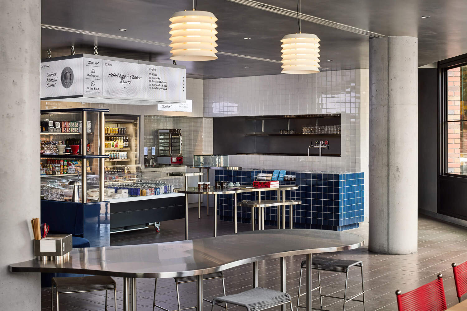
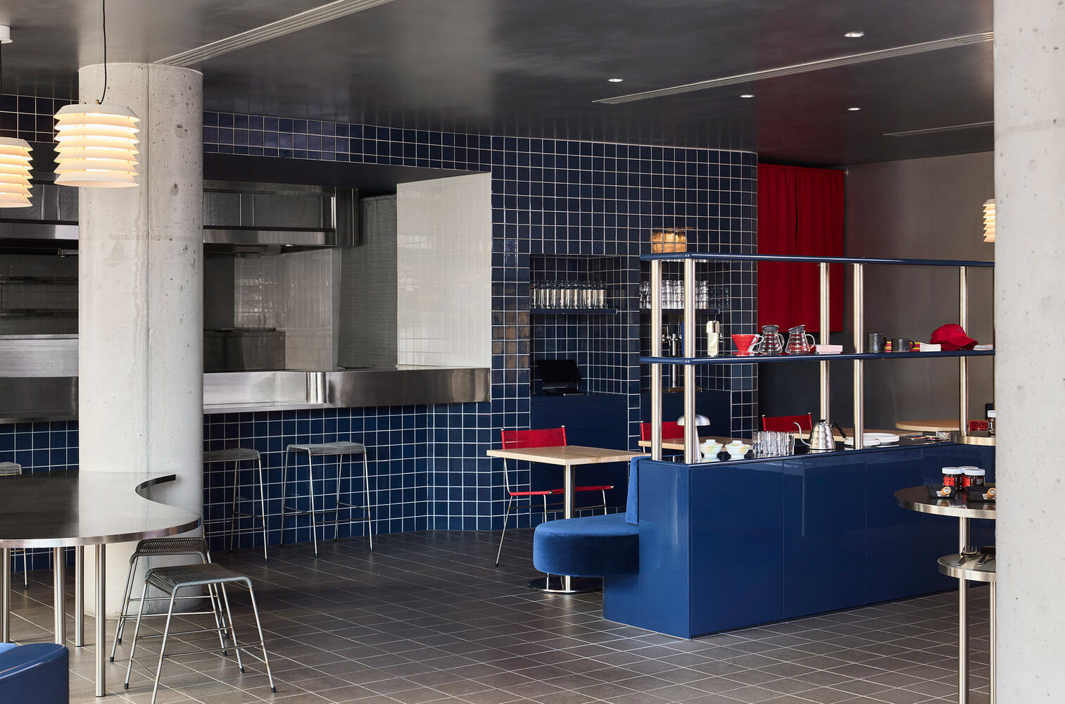
Drawing on the traditional Japanese colour system, goshiki, the red, black, blue, white, and yellow palette creates a meaningful cultural link, anchoring a contemporary space that celebrates the spirit of Japan in every vibrant detail.
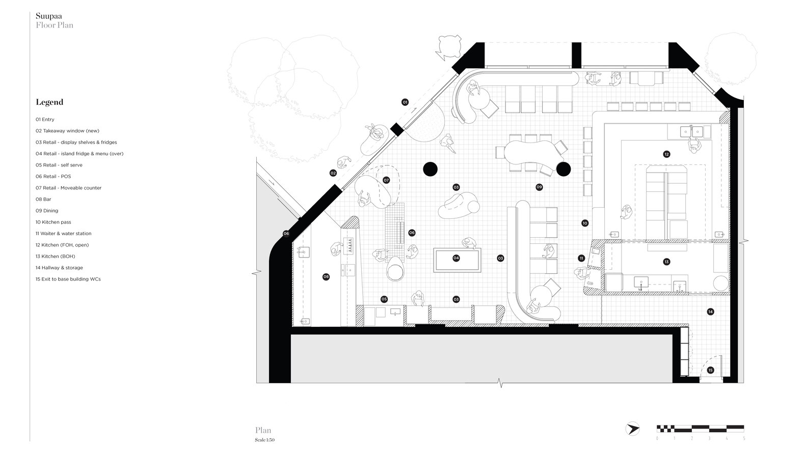
As a method of rationalising the dynamic programmatic requirements, the minimalist application of these bold colours creates an ordered system for delineating between retail and hospitality.
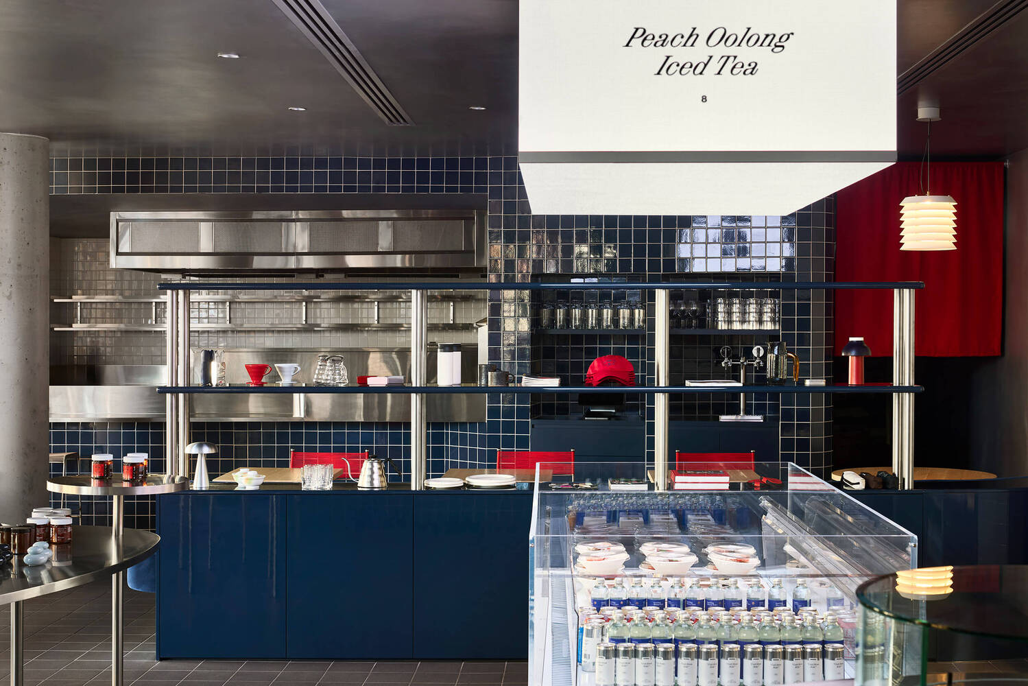
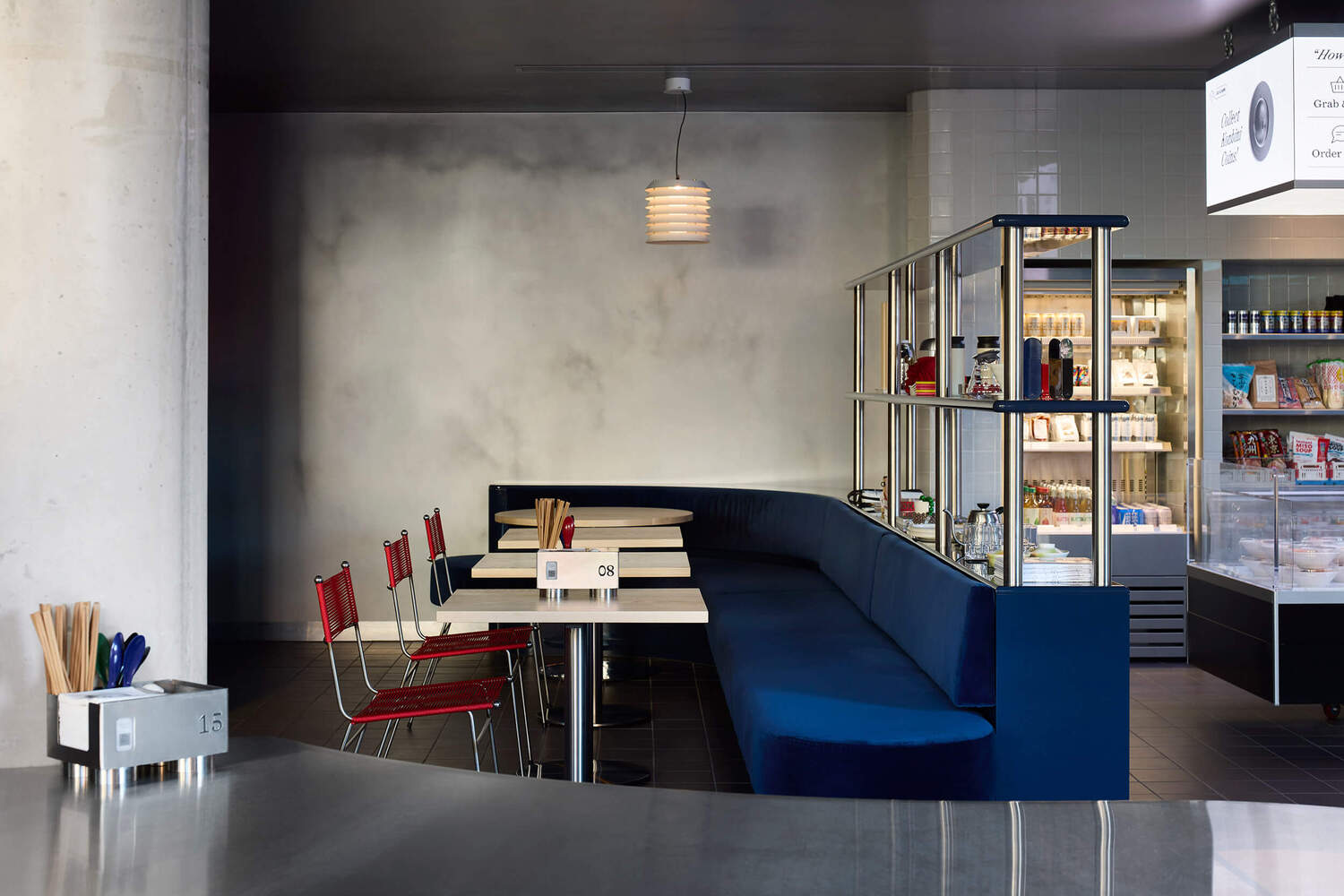
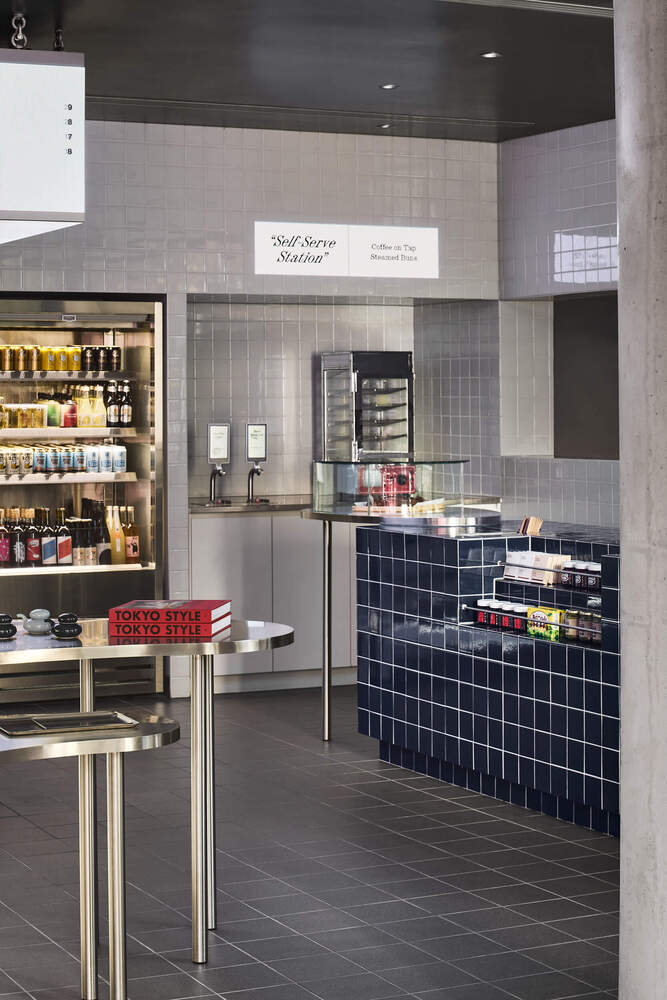
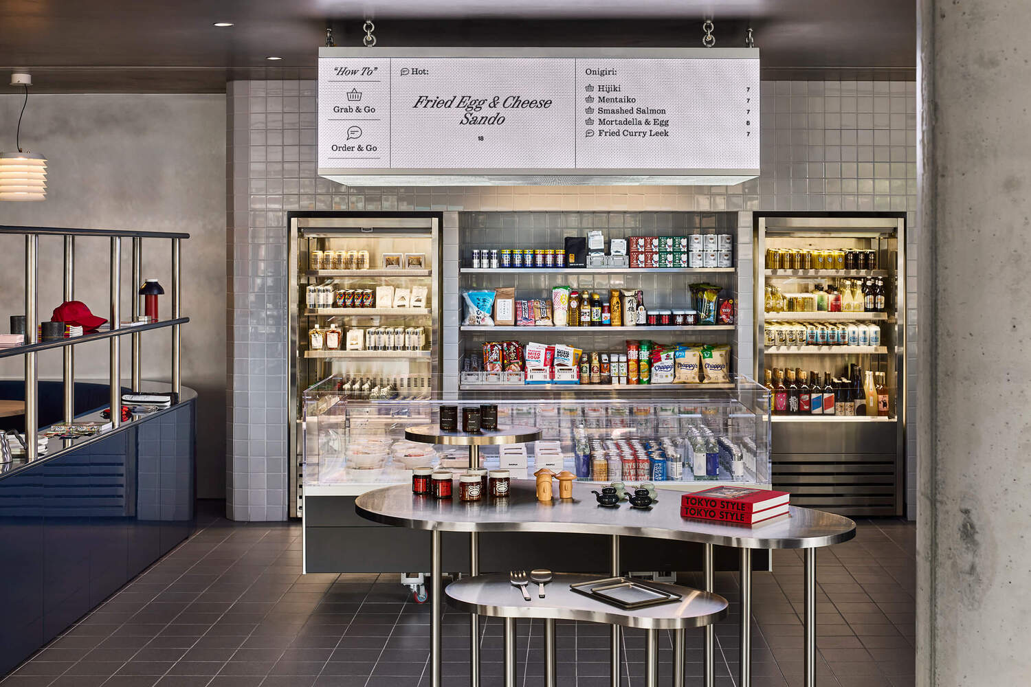
Always in motion, the retail and takeaway space unfolds as a luminous white environment — a reimagined konbini, pared back yet bold. Overhead, a fluorescent light box illuminates the central display, revealing a menu that shifts and evolves, designed to be both minimal and elevated.
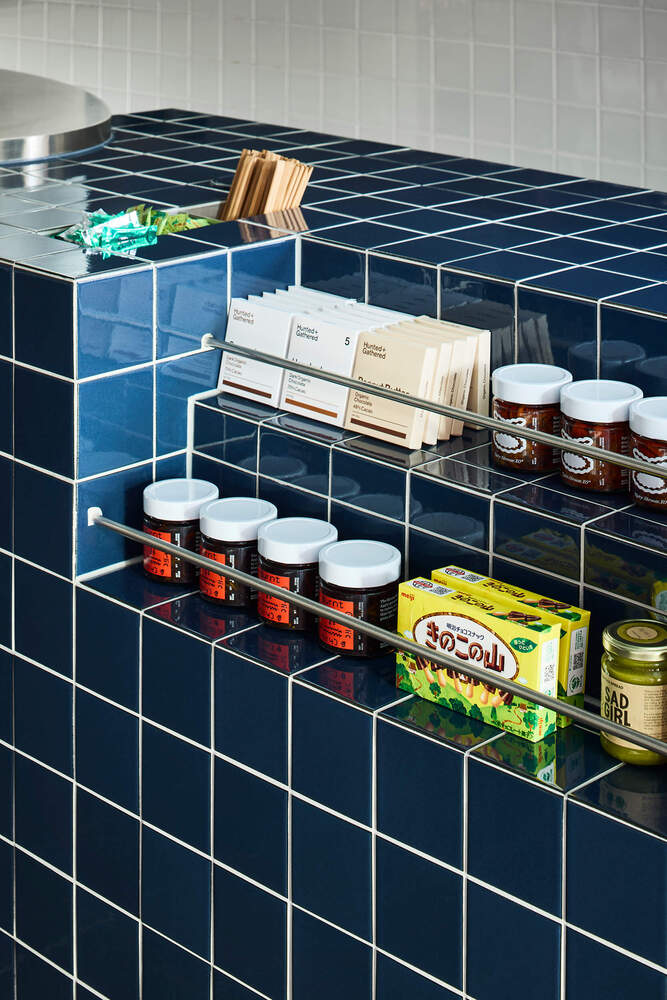
Merchandising follows a strict grid, framing modular packaging like curated artefacts — where the food itself becomes the graphic.
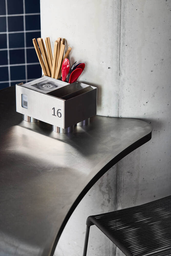
Smaller items, such as chopsticks and wasabi, are discreetly housed in precisely crafted recesses within the tiled point-of-sale joinery, contributing to the overall graphic composition.
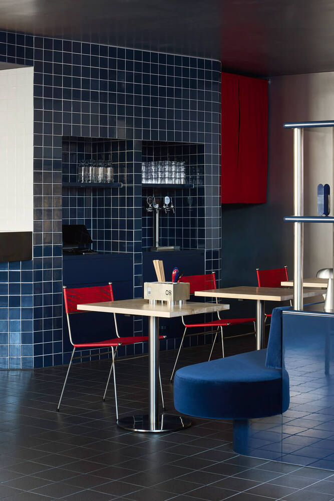
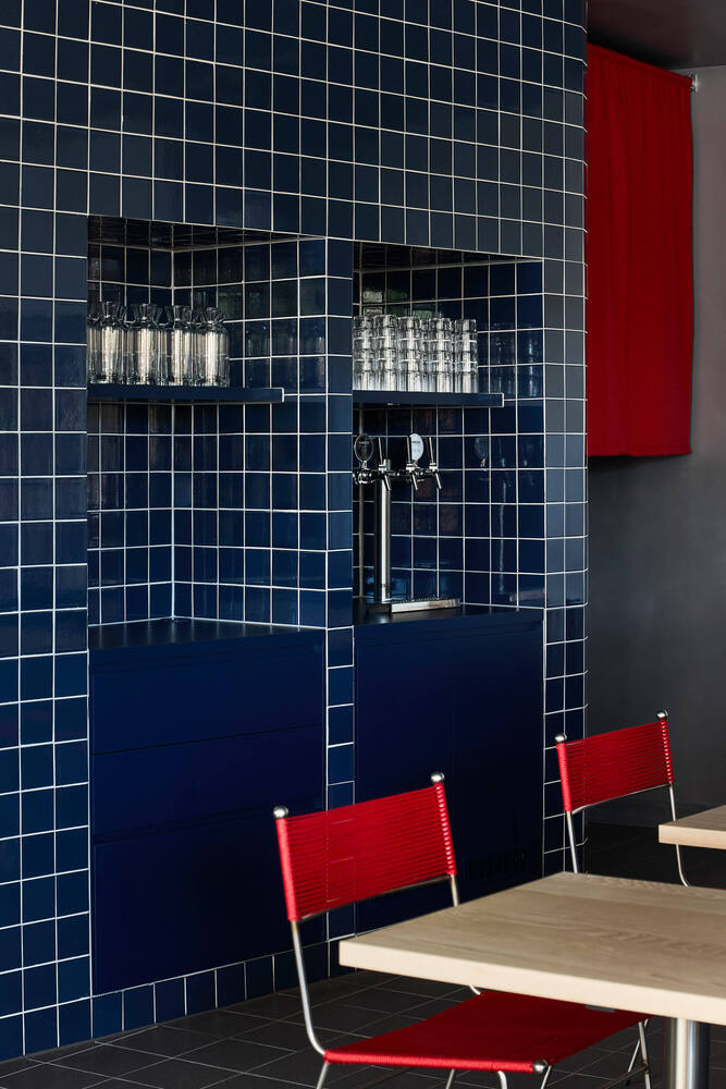
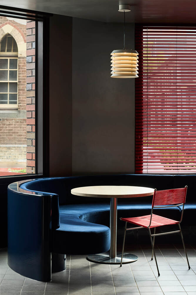
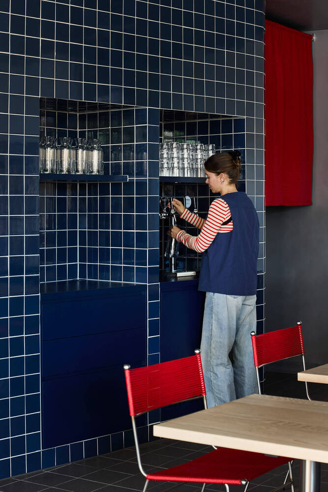
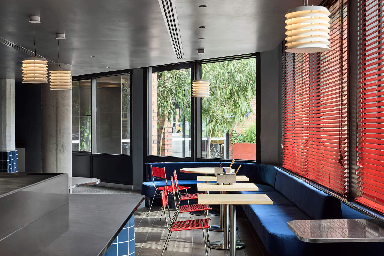
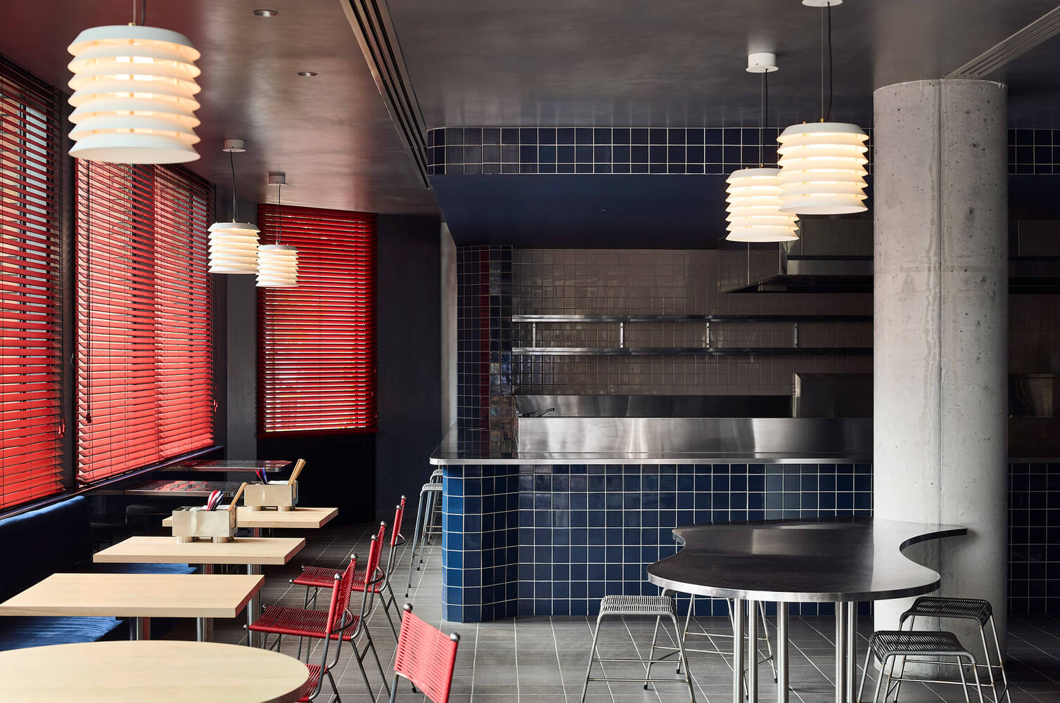
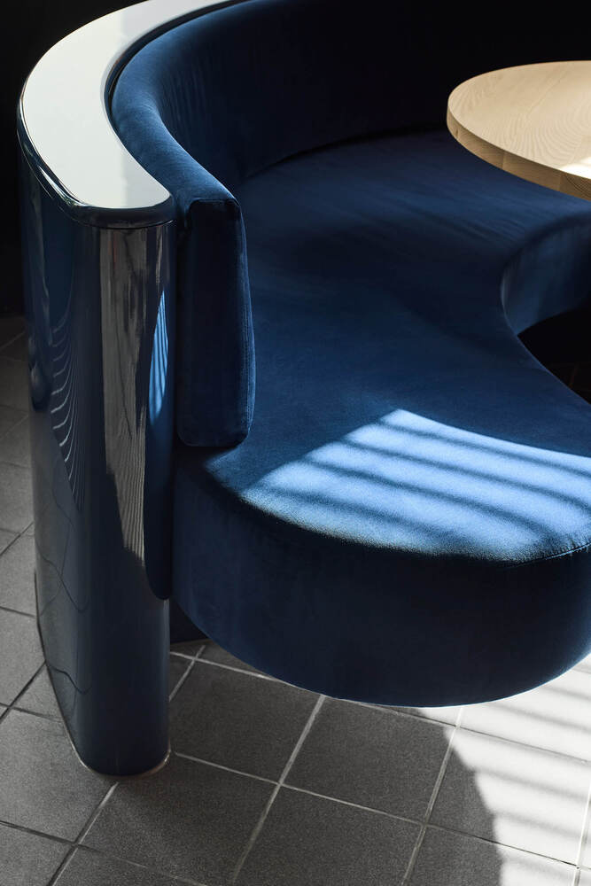
Deeper into the space, rich blues anchor the hospitality area, offering a comforting warmth that contrasts with the shop's bustling energy.
Soft textiles, timber tables, and the gentle glow of modern lanterns cultivate an inviting ambience, encouraging a relaxed, dine-in experience. Though distinct, the two areas are connected by open shelving, thoughtfully lined with authentic Japanese products.
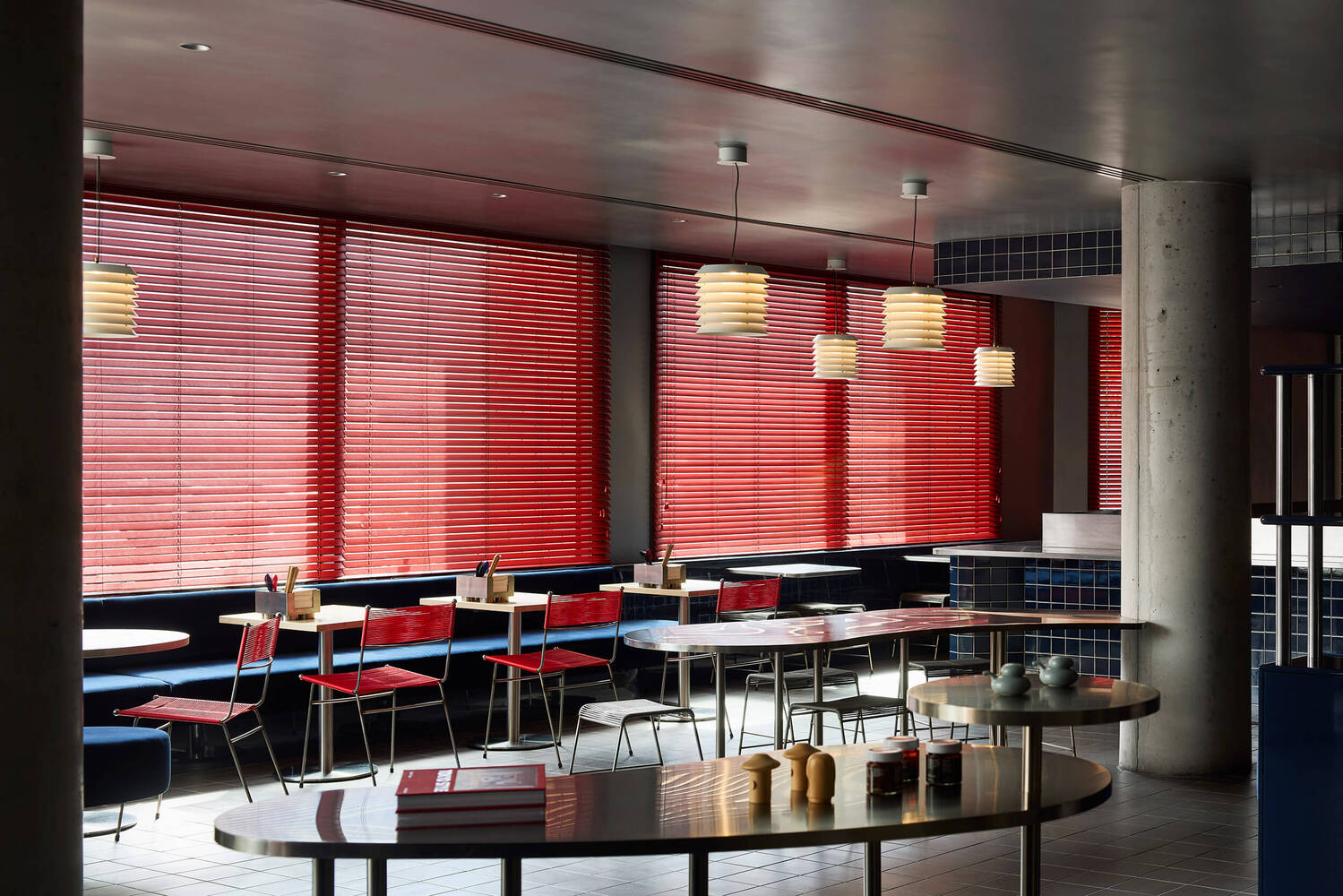
Bold red accents are integrated throughout the space — most notably in the blinds, which gently filter light across the day.
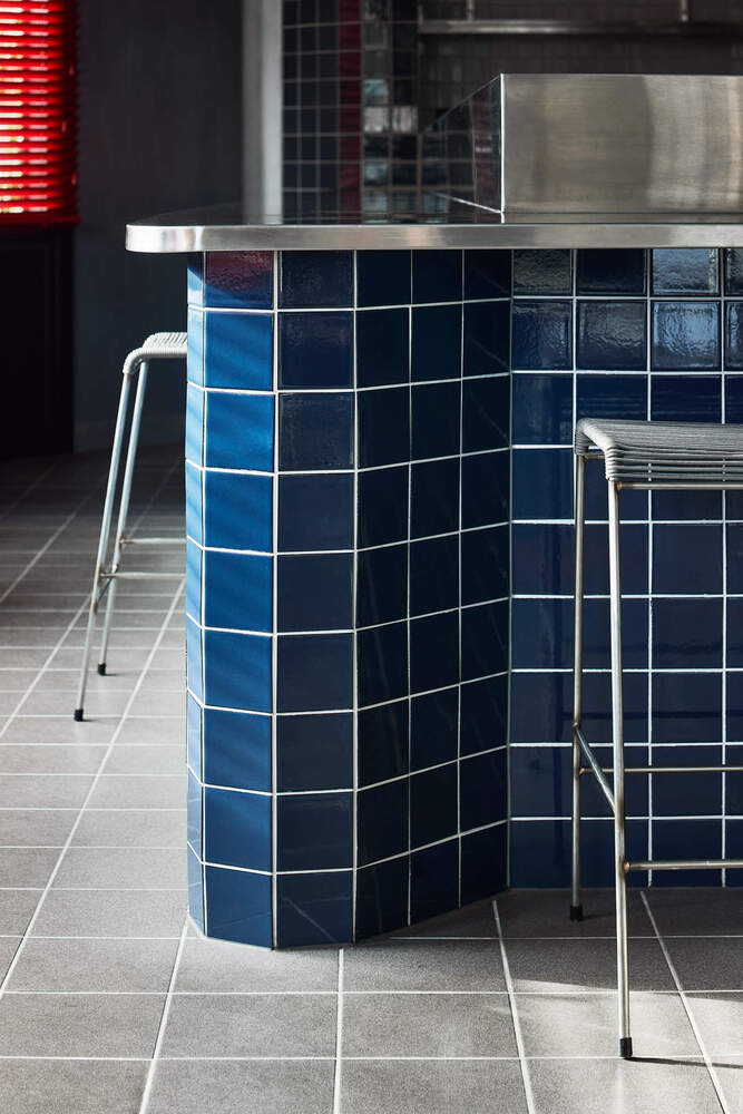
These elements are visually echoed in a custom red version of the classic Meadmore corded chair, complemented by carefully selected accessories in matching tones.
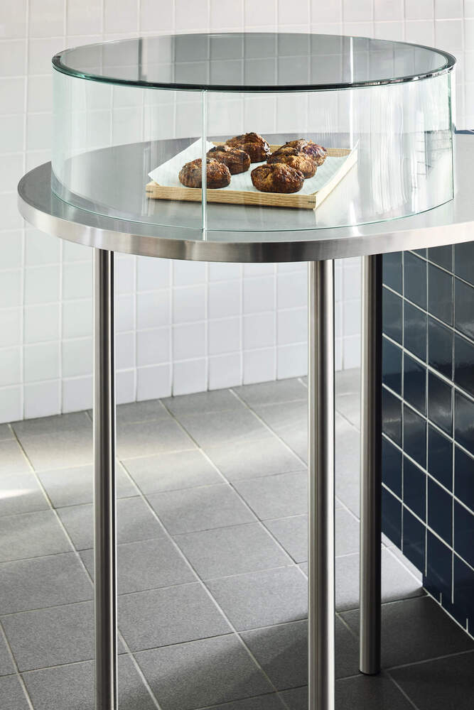
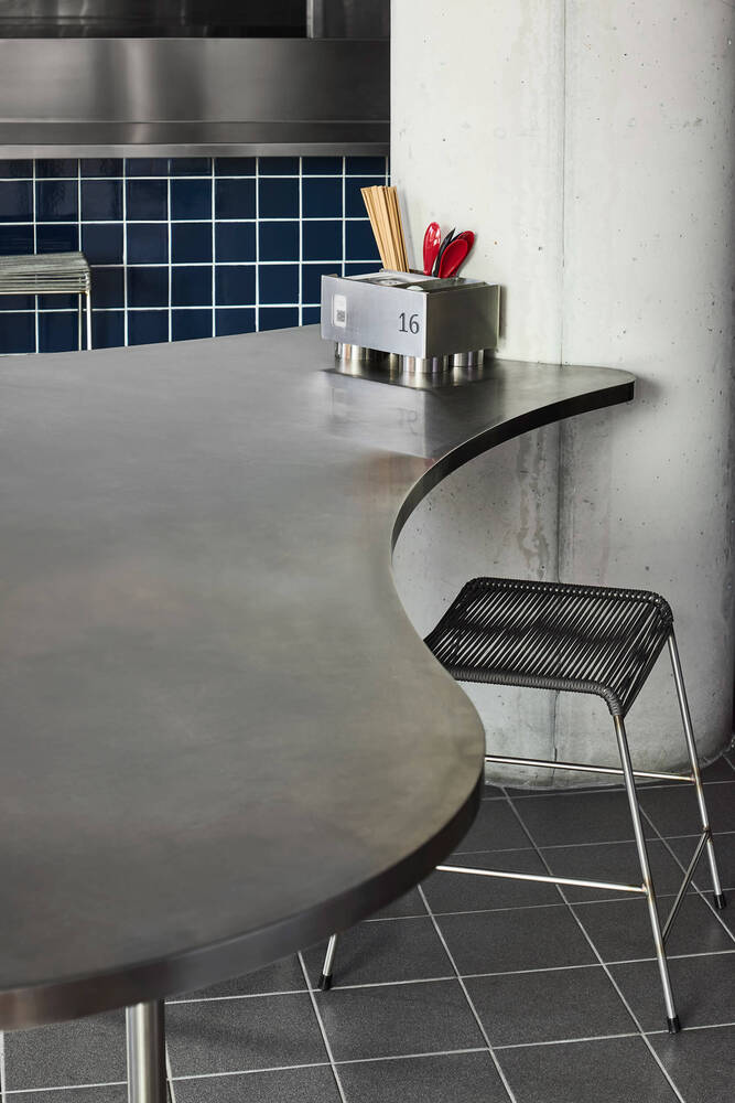
As a counterpoint to the space's structural rigidity, organic forms are introduced via freestanding stainless steel tables, designed to float seamlessly throughout.
These versatile pieces serve multiple functions — from indoor/outdoor dining to displays and service elements — and can be removed to accommodate events.
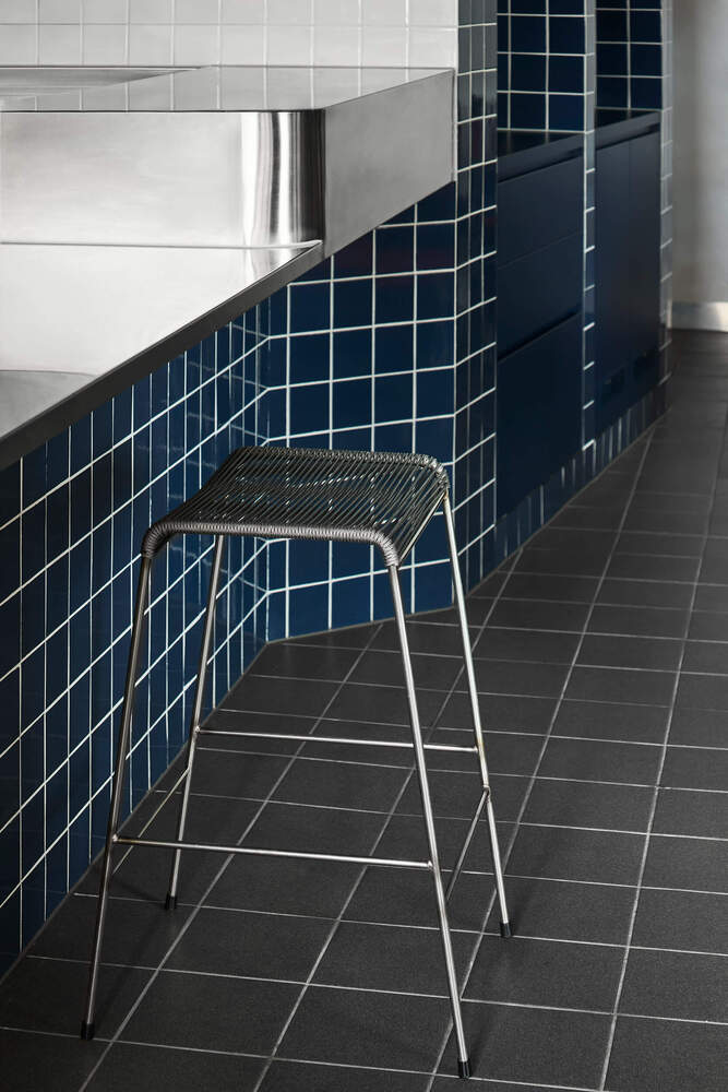
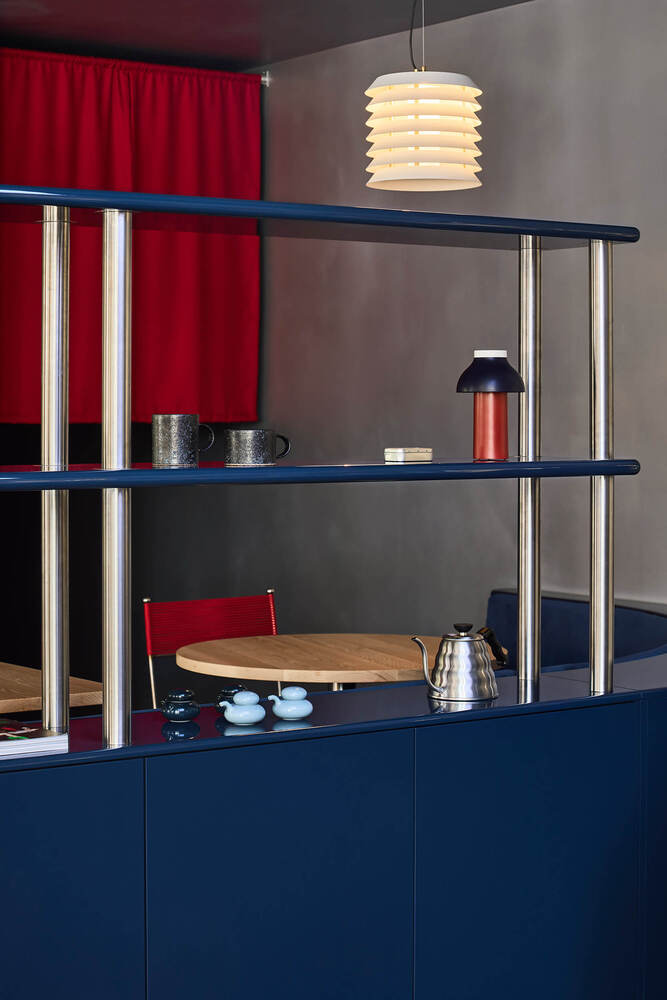
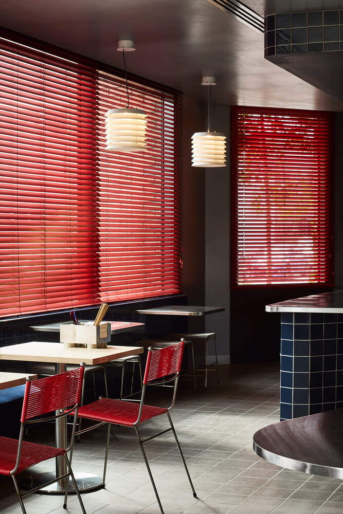
Their curves are repeated in the banquette seating, while stainless steel surfaces on the kitchen's forward-facing elements provide a cohesive material continuity.
As its name suggests, Suupaa — a Japanese word meaning both 'super' and 'supermarket' — offers a layered sensory experience, elevating the perception of procuring a quick bite to eat.
Through subtle gestures that conjure the essence of Japan, it redefines expectations of fast dining and reimagines how such a space can be felt and understood.