World Super Market
WORLD SUPER MARKET
Kiki Archi
ARCHITECTS
Kiki Archi
LEAD ARCHITECT
Yoshihiko Seki
GENERAL CONTRACTOR
Uzhou Haiyida Construction & Decoration Co., Ltd.
DESIGN TEAM
Saika Akiyoshi, Che Zeyu, Simin Lin, Takahito Yagyuda
PHOTOGRAPHS
Ruijing Photo
AREA
336 m²
YEAR
2025
LOCATION
Suzhou, China
CATEGORY
Retail Interiors
English description provided by the architects.
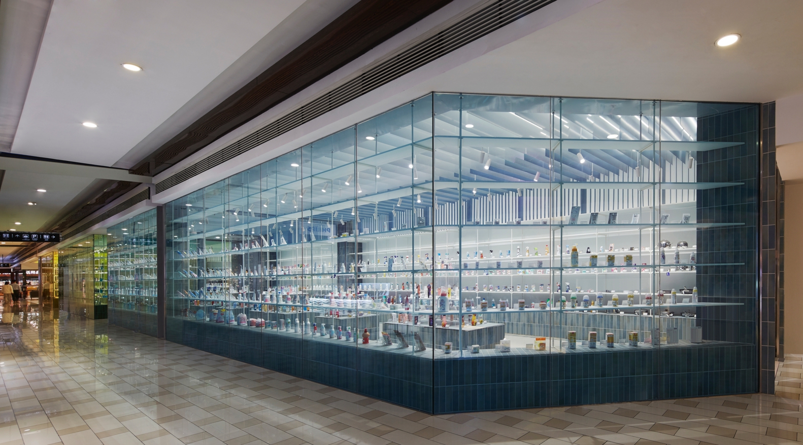
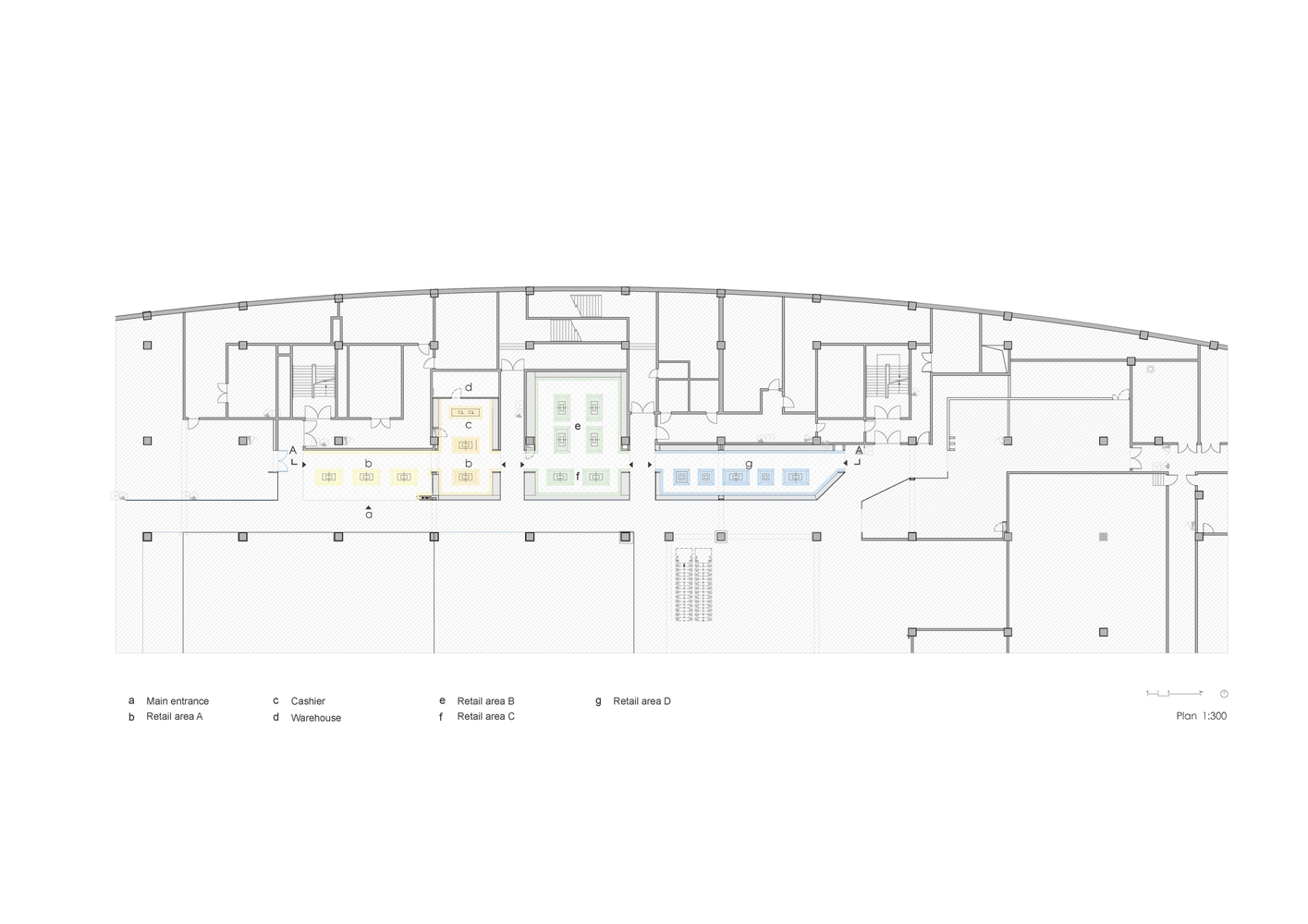
World Super Market is located on the basement level of MATRO Department Store, composed of a series of continuous retail units.
The owner has concentrated the multi-national brand resources of Matro Luxury Centre here, creating a commercial environment that balances global vision with everyday warmth.
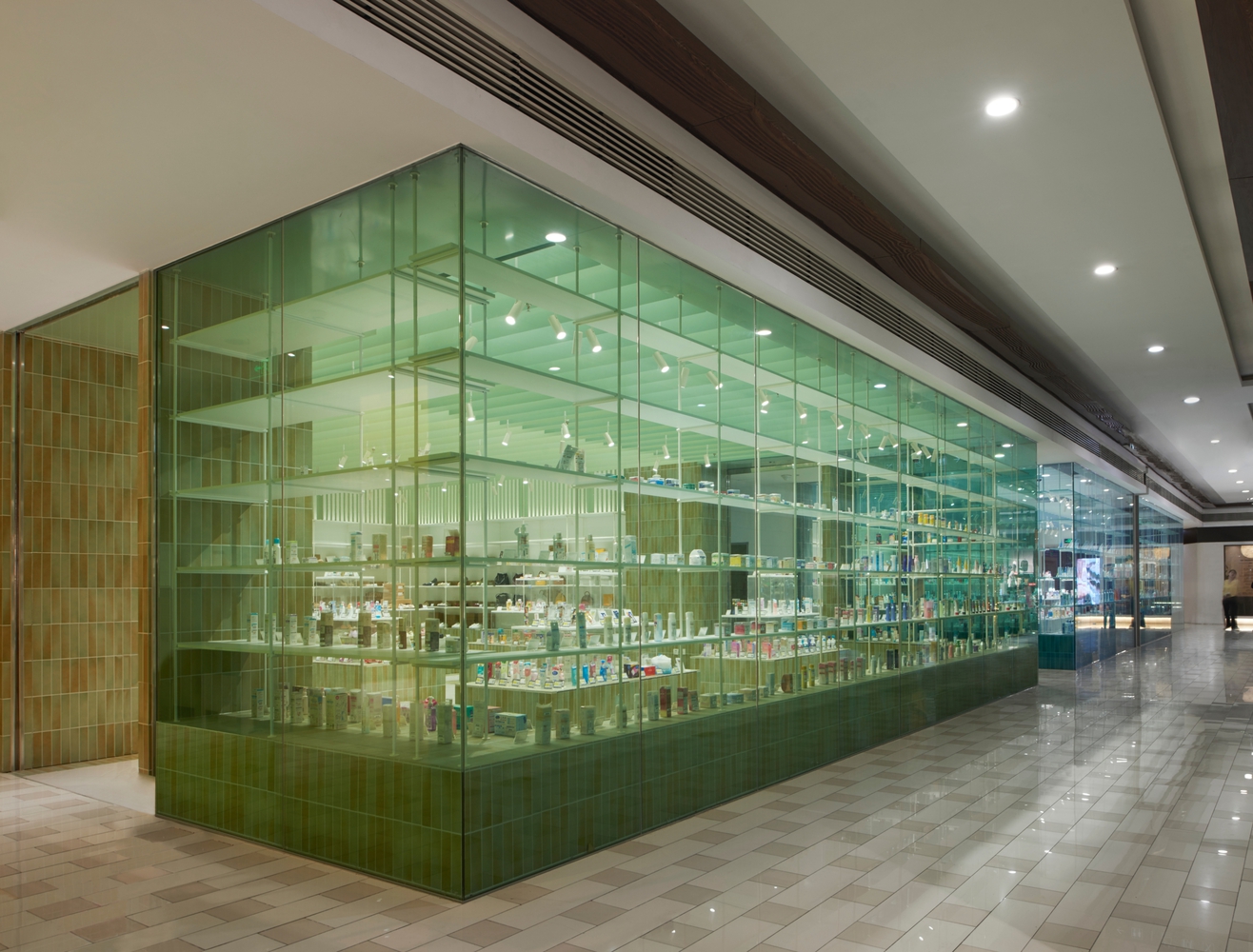
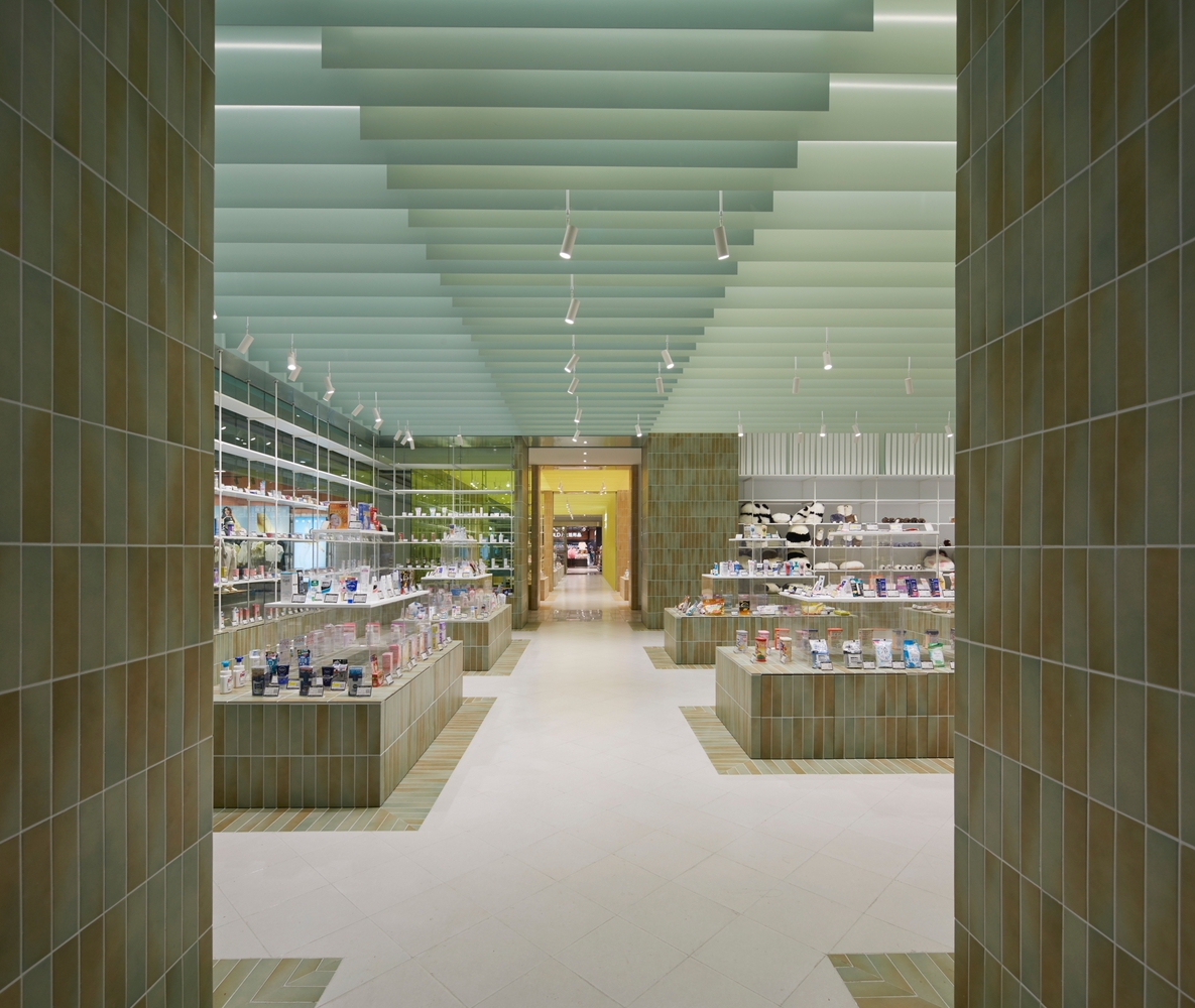
Architect Yoshihiko Seki of KiKi ARCHi, serving as the lead designer, drew inspiration from the concept of a "color spectrum," unifying color and texture into a woven visual rhythm. Through flowing color cues, the design unfolds an experiential commercial narrative centered on materiality and color.
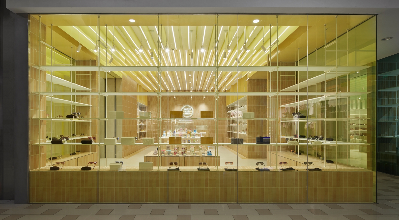
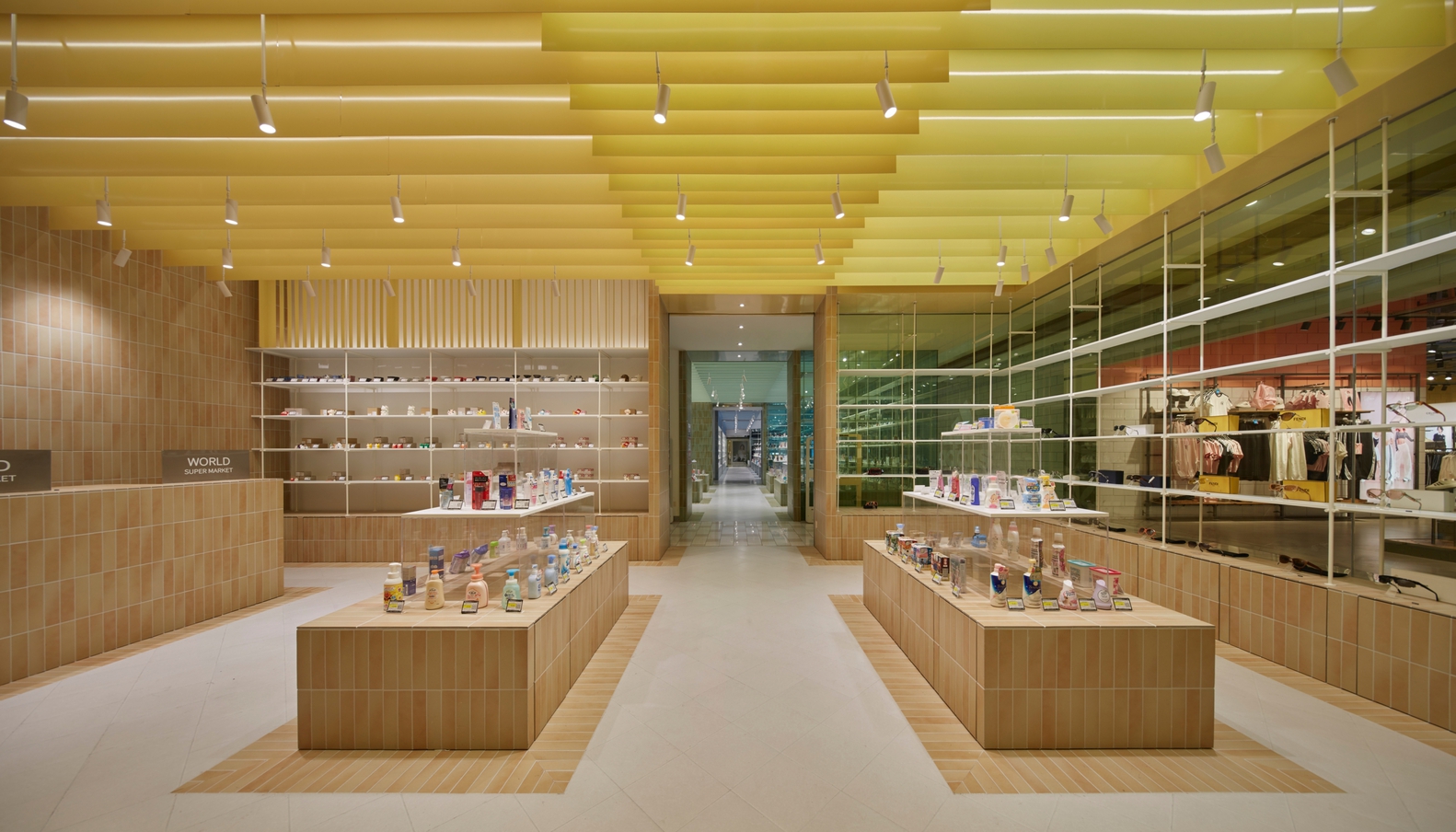
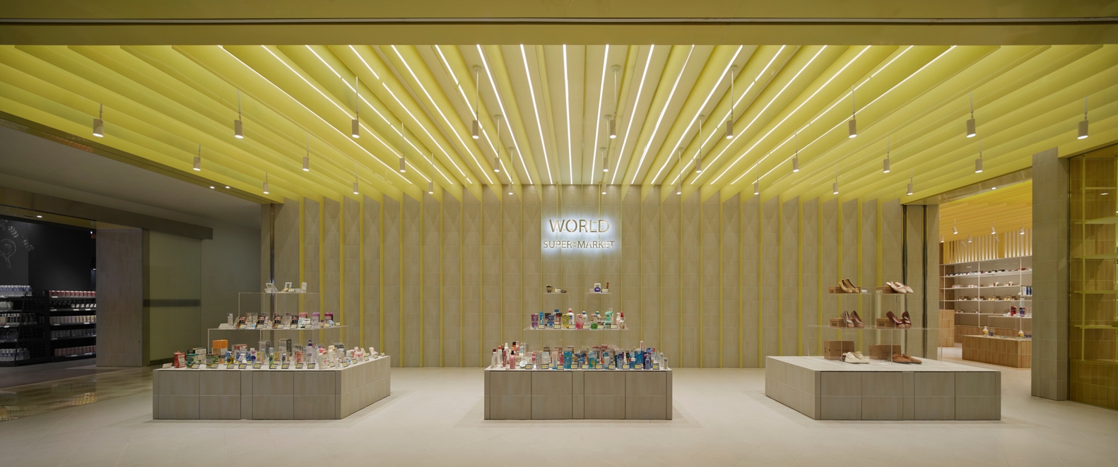
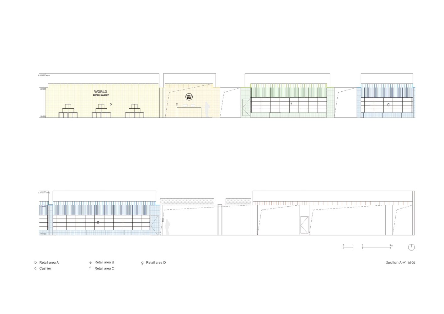
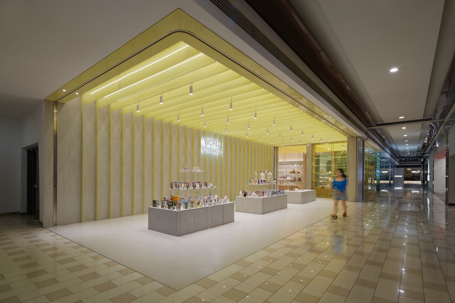
Starting from the surrounding context, the left side of World Super Market's entrance connects to the original market of the mall, whose spatial tone is a warm yellow. The designers continued this familiar visual memory by establishing the main entrance display area in yellow, allowing a seamless visual transition between the project and its surroundings.
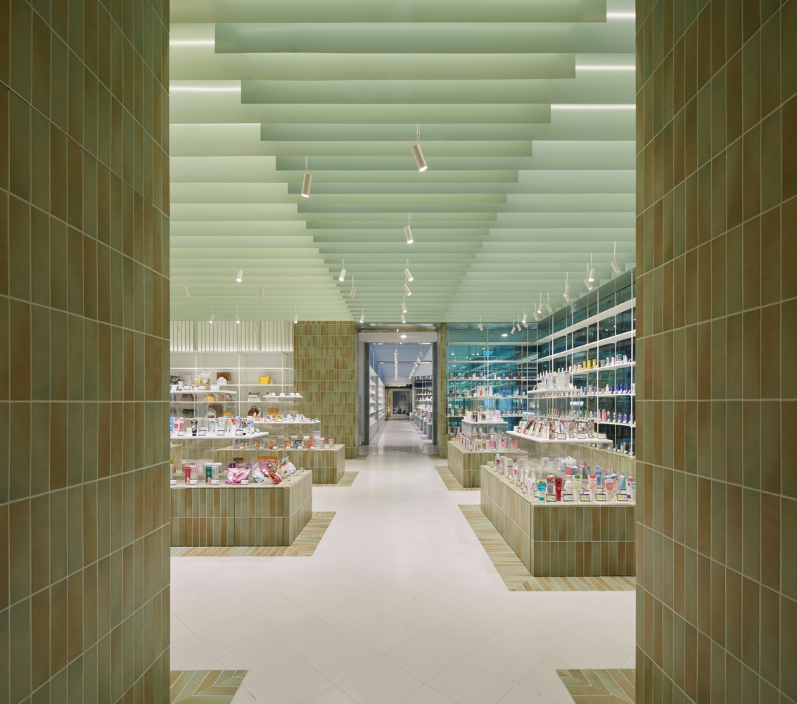
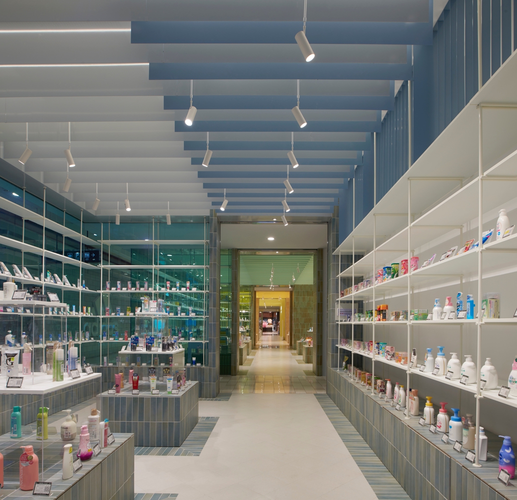
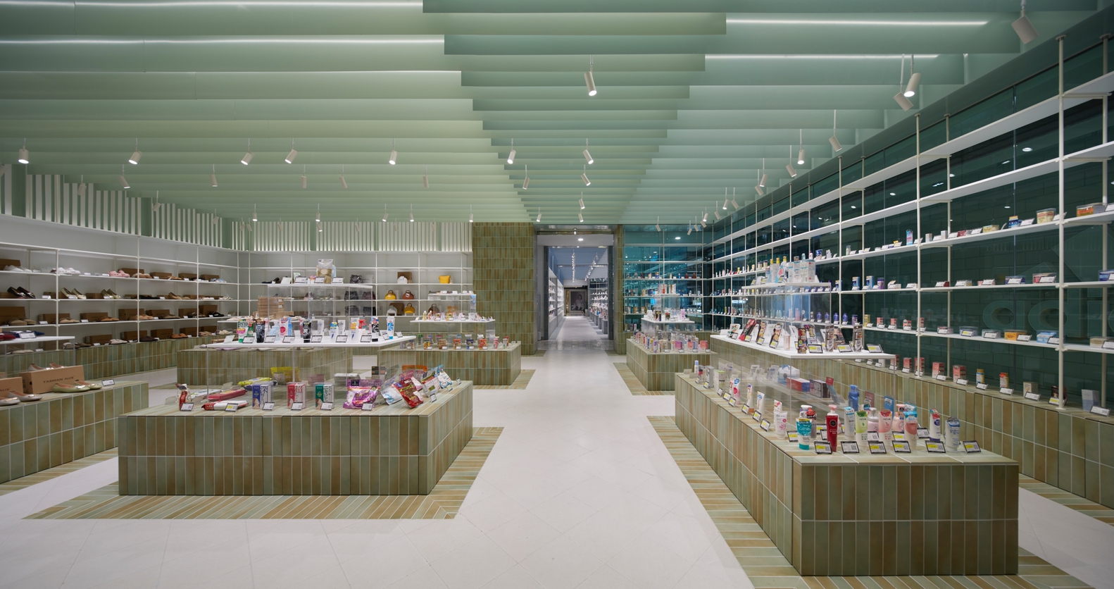
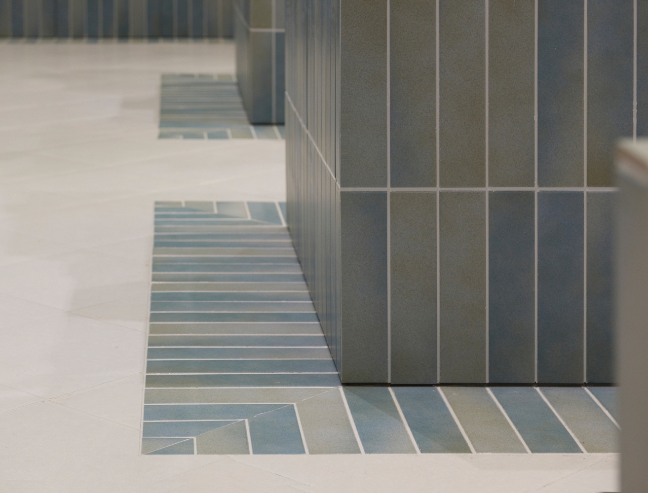
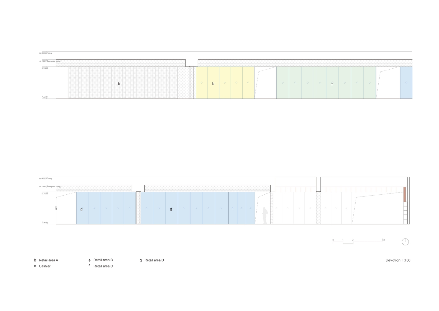
Existing aisles separate the continuous retail units by nearly 2 meters—a "break" that the designers transformed into a new spatial rhythm. Using partitions as a medium, diversity is embedded within the space. Along the color spectrum, yellow gradually transitions into green and blue, granting each display area an independent yet coherent dominant color, forming a complete visual axis throughout the space.
These easily recognizable colors flow from the interior outward, allowing visitors to intuitively perceive both the unity of the store and the distinctiveness of its various products—a harmonious coexistence of singularity and multiplicity.
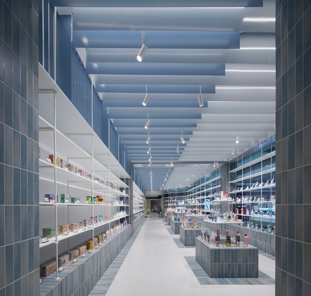
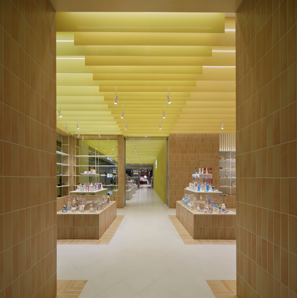
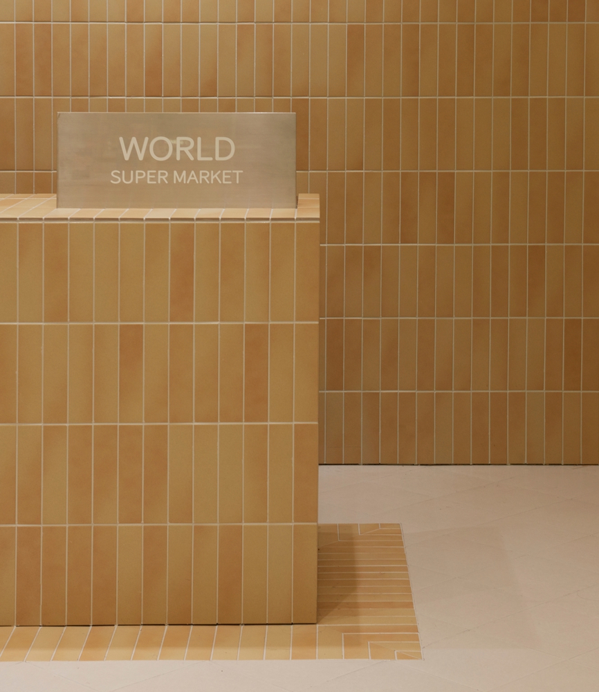
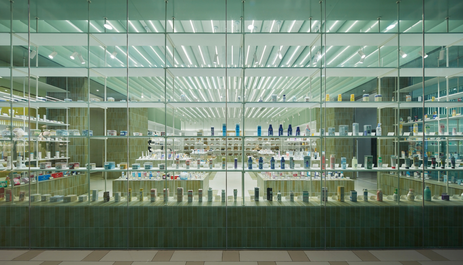
The material palette is deliberately chic, including ceiling aluminum panels, small-format tiles, and curtain-wall glass. These everyday, modest materials, through careful proportion and combination, create subtle textures and layers. The designers implemented a unified system logic across four main spatial elements—ceiling, walls, floor, and display fixtures—assigning corresponding colors to each.
Given the 2-meter spacing and sequential layout of the display areas, color transitions are handled like watercolor washes: saturation is moderately restrained, enabling tones to flow naturally across different materials and surfaces. Even within a single-color family, the design reveals rich layers and a sense of breathing.
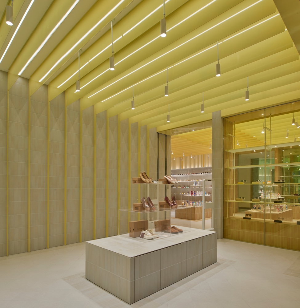
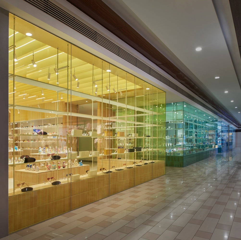
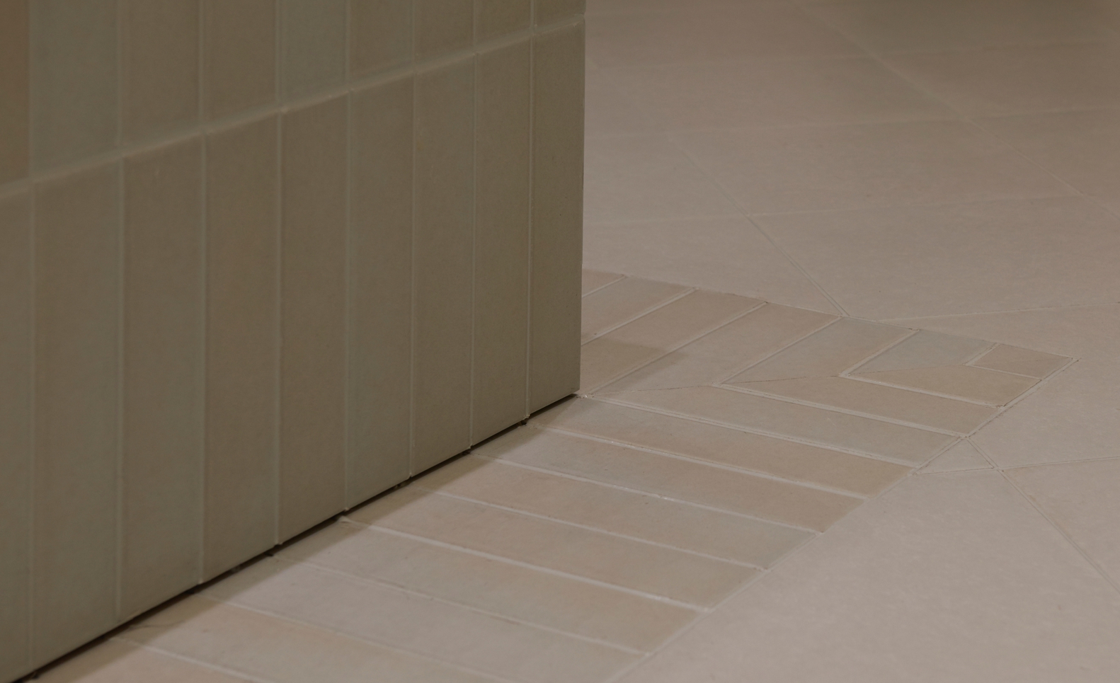
Spatial details are layered and deliberate. Two rows of ceiling aluminum panels in the same color but with different saturations overlap sequentially along the depth of the space, with the overlapping sections precisely aligned with the original brick floor areas and aisle openings, creating a comfortable and rhythmic visual symmetry. Walls and central display installations are covered in small tiles, their tones echoing the dominant color of each zone.
At the junction with the floor, the interplay of material continuity and transition produces a subtle sense of enclosure and nuanced light and shadow. Upper portions of wall-mounted shelves and fixtures return to a simple white, visually linking different color zones while balancing and calming the internal gradations.
World Super Market presents a restrained yet abundant sensibility—pursuing the ultimate detail within a "pure" logic. From color transitions to material connections, from visual axes to display layering, visitors navigating the space are not only browsing products but also experiencing a meticulously woven sensory order: clear, fluid, soft, yet imbued with strength.