YEAR
2012
LOCATION
Osaka, Japan
TYPE
Commercial › Retail
This is an interior design for a hair salon in Osaka, Japan.


The interior design was by Reiichi Ikeda of reiichi ikeda design, and the graphic design including the logo design was by Yuma Harada of UMA/design farm.
The two companies shared the concept with each other, and comprehensively directed the hair salon together.


Generally, a hair salon has a conventional traffic line of waiting, shampooing, cutting, and so on.
To specially add the uniqueness as a spice, I dotted with some visually standardized box-shaped objects such as furniture and a spot that have roles.


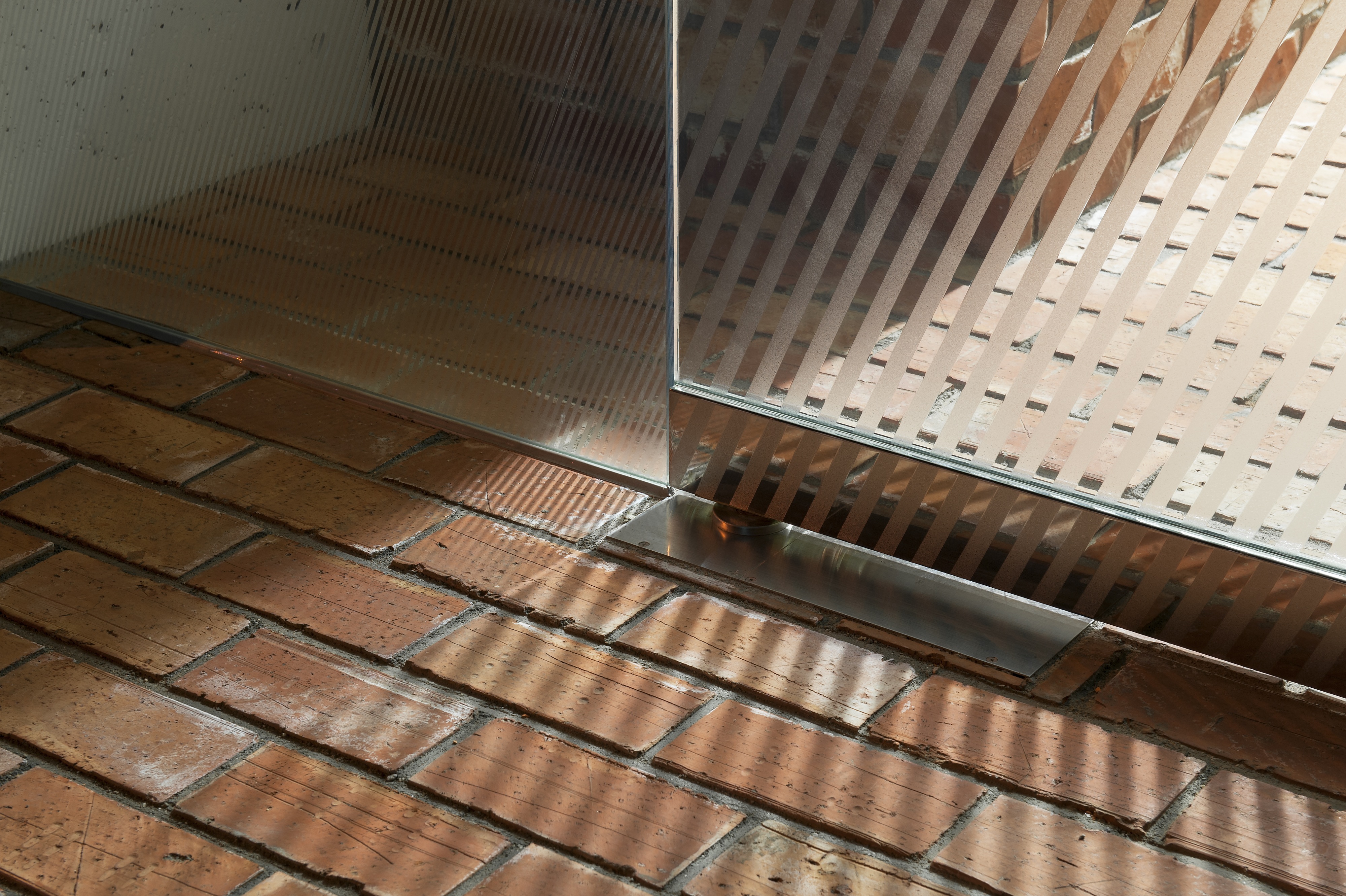
The angle of the diagonal lines which constitute the facade and the interior visual effects follows the concept of the logo "IRO".
"O" in the logo "IRO" is rotated 23.43 degrees to be parallel to the axis of the earth.


Even though the Japanese word "IRO" means colors in English by ordinary, we considered it as what gives us the seasonal indications with the Sun instead of as being colorful.
The light streaming through the diagonal lines and its shadows are shifted from season to season.


Additionally, the moire effect caused by the overlapping lines helps to bring out the visual movement in the design.